Is your feature idea a vitamin or a painkiller?
Have you ever designed a Ferrari? Or how about a Mustang — but when it came to build, the product that was delivered resembled something more like an ox wagon!
Following on from a recent article I wrote about How To Be A More Influential Designer, I wanted to jump into the topic of creating valuable designs that actually get implemented, instead of just gathering dust somewhere on a shelf… Or more poetically — end up in the Design Graveyard.
As Designers, we can create beautiful experiences in a fraction of the time it would take to build. But how many times can you honestly say your design was built exactly as you imagined, with all the animations and alignment as planned?
Shipping a Minimum Viable Product (MVP) is one thing, but when a design isn’t built as planned because there are features that were just way too complex to implement — that’s something else. And it can be avoided by evaluating our designs as we go.
Prioritising what we do design — and what we leave out — in the same way the Head Of Innovation or Digital Strategy might do, will help ensure that more of our creations see the light of day, instead of ending up as another ‘concept’ portfolio piece.

How to evaluate your design concepts
You need to put your business hat on. As creatives we love creating beautiful things that move and bounce and animate, but they’re expensive to make — and in my experience more often than not they don’t get built unless you’re willing to do the front-end yourself.
So if you’re not into code then here are some principles you can keep in mind to help you deliver more value to your team — and make more cool sh*t!
01 | Vitamin or painkiller?
In Entrepreneur magazine, George Deeb reckons one way to evaluate products is by asking, is it a Vitamin or a painkiller?
Vitamins are nice to haves, that cost money, don’t return a convincing return on investment, and in the eyes of most consumers — aren’t really essential. So in a product design — micro interactions and animations are mostly referred to as vitamins… nice and pretty, but non-essential.
Painkillers are must-haves, that solve a real world problem, get high adoption, and make you think “what did we do before this?”. Intuitive Information Architecture is a painkiller — as is pre-build user testing.
But that approach is still quite high level…

02 | The Trifecta
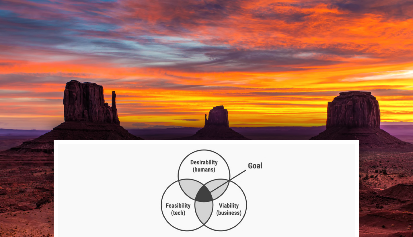
Kristiann Ortonn says the sweet spot is at the junction of Desirability, Feasibility, and Viability — aka The Trifecta of innovation.
- Desirability is how appealing it is. Visually beautiful, unique in offering, innovative or just downright awesome. You can usually judge how well you’re performing here by running user testing and hearing it from the customer — a Systems Usability Score in the 90’s (out of 100) is a good omen!
- Feasibility is an honest and level-headed estimate of how likely a product is to succeed based on strengths, weaknesses, opportunities and threats in the industry — as well as the investment required to get it live. Strategists, Business Development hustlers and Development leads will be able to help you here.
- Viability is basically whether or not the product would get adoption, but also if it would be loved and recommended. Again, user testing is your friend here!
But if we take a step back, there are other factors to think about when you’re weighing up your concepts and pondering their worth.

03 | Four Emotional Levels
Diving more into the Desirability aspect, have you ever heard of Maslow’s Hierarchy Of Needs? They’re basically the 5 basic Human needs, similar to instincts, that contribute toward Human motivation.
These exist in Design too.
When we’re using products, we also have a hierarchy of human needs — but instead of Maslow’s pyramid — we have others which must be met in order to have desirable and delightful experiences.
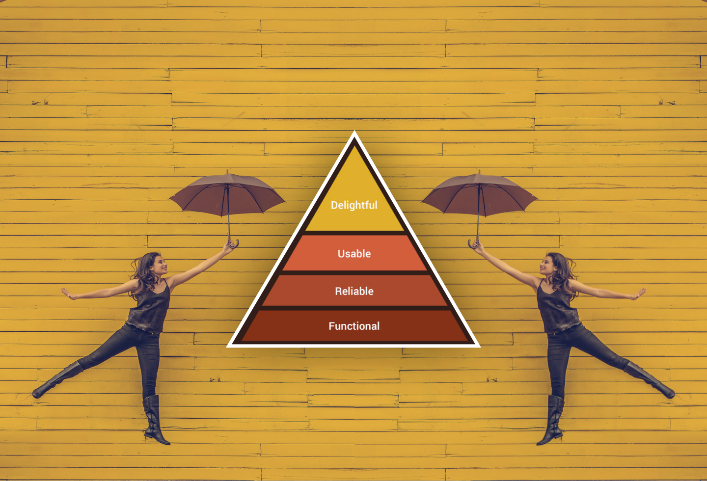
Aaron Walter’s book Designing For Emotion says there are 4 emotional levels to any design:
Functionality, Reliability, and Usability are the basic foundations. Level 4 is Delight!
- Functional is whether or not your design meets the user’s need. So let’s take a maps app example. Functional would be whether or not it tells users how to get from A to B. It’s what you’d expect right?
- Reliability is whether or not the information provided is accurate. Are the directions correct? Are they consistent every time? Are the distance units in standard local metrics? Is the earth shown as being flat? Hmmm… 🧐
- Usability is whether or not users can read the text, or find the information they’re looking for, or simply understand what the product does ie: does the button do what is says it will?
- Level 4 is Delight! That’s when a user comes across a feature they didn’t even know they needed, but absolutely love when they find it. Like getting to you destination and finding out you’ve burned 200 calories — the nutritional value of a plate of fish ‘n chips! Score!
Another way to cut this cake is to break it into three levels instead of four…

04 | The Kano Model
Basically this is a way to categorise the features of your product or service into buckets according to how cool they are. The Kano Model explains it well:
Level 1: Threshold Attributes or Basics. These are the basic features that customers expect a product or service to have. So for example, when you book into a hotel, you’d expect hot water and a bed with clean linen as an absolute minimum. Anything less, you’d freak out.
Level 2: Performance Attributes or Satisfiers. These elements are not absolutely necessary, but they increase a customer’s enjoyment of the product or service. So imagine in this hotel, you discover there’s free superfast broadband and HD TV. Awesome!
Level 3: Excitement Attributes aka Delighter’s. These are the surprise elements that can really boost your product’s competitive edge. They are the features that customers don’t even know they want, but are delighted when they find them. So after you switch on the TV you find out they have an AR headset that you can play games on. TOTAL surprise, real competitive edge!

Conclusion: avoiding the Design Graveyard
Avoiding the Design Graveyard is as easy as keeping these concepts in the back of your mind as you work.
You can also check in with a developer or team lead as you go to get their perspective from a technical feasibility or product viability standpoint — this can help avoid nasty surprises further down the track.
If you find you’re having trouble getting cool stuff built — ie: the really detailed micro interactions you create in After Effects or Principle — try talking to the project lead and see if you can reserve a sprint at the end of the project for animations and enhancements. This can work as a good middle ground between design and development teams.
