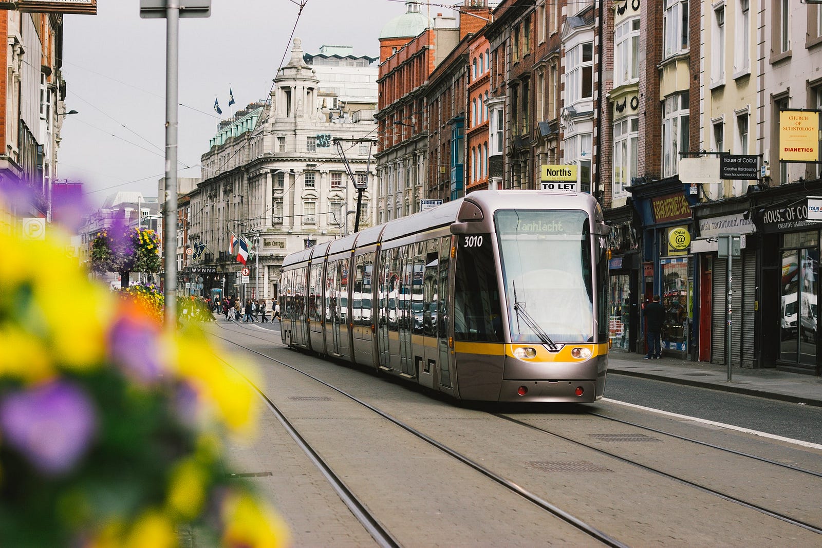
Do you love absolutely love traveling on public transport… or do you simply see it as a utility that gets you from A to B?
It’s a service that is used by millions around the world and is improving every day — integrating with new players like Uber, and allowing more people to travel in comfort while reducing the number of cars on the road.
So imagine the excitement for our digital team when we got the opportunity to redesign the future of public transport in our local city.
Sections:
- Key learnings
- Getting started
- Project team
- Approach
- Research
- Kickoff workshop
- Future State Customer Journey (1st draft)
- Customer interviews
- Affinity mapping
- Customer journey map
- Analytics & personalization strategy
- Information Architecture
- Service blueprint
- Final showcase
Key learnings
- Project plans can change: What we pitched and what we delivered were slightly different, but that was due to us receiving new information at the start of the project.
- Avoid over delivering: We ended up delivering more wireframes than originally contracted and while it felt like we were leaving a good impression for the client, this wasn’t in the original statement of work. Over delivering means you may get a happy client, but you’re potentially missing out on what could have become an extension to the project.
- Keep the energy up: When you’re running a workshop, the quality of the information you get from stakeholders depends a lot on their energy levels during the activity. Make sure you ease the group into the session with a suitable warm-up activity, allow everyone to speak, move the group around, and provide snacks!
- Offer incentives: User testing participants need incentives, if you try to skimp on incentives it can end up blocking the project and risk throwing it off schedule.
Starting Our 9-week Discovery Phase
We’d all spent the last few weeks eagerly anticipating the start of this pioneering project which had received a fair chunk of local media coverage.
We’d researched the latest public transport developments across the globe and now, saturated with knowledge and coffee, were ready to unleash and make history.
This was our design brief: Design a holistic customer-centered web experience solution for the future payment and ticketing of our city’s public transport network.
- What is the user experience vision?
- How will that manifest on desktop & mobile?
- How might the experience be personalized based on behavioral data?
- What will success look like and how will it be measured?
- How might the information architecture of the digital interfaces be consistent, clear and customer-focused?
- What business functions are required and how do they interact internally and externally?
- What platform capabilities are required to fulfill future business objectives?
Scope: Not all user types or fare structures will be included in the initial Discovery Phase. A subsequent Detailed Design phase will take a deeper dive into those areas.
Timeline: 9 weeks.

The Project Team
The team was a mix of ‘us’ and ‘them’ (Consultants and Client-Side stakeholders) combining our expertise with their in-house specialities to cover all aspects.
Our team: 7 of ‘us’ brought core capabilities such as Service Design, UX Design, Cognitive & Analytics, and Technical Business Analysis.
Their team: 4 of ‘them’ provided Systems Engineering, Technical, and Enterprise Architecture know-how, with a further 10 or so stakeholders and SME’s on call to feed into requirements along the course of the project.
Logistics: We worked 4 days client site (1 day per week at our HQ).

Our Approach
Our initial project plan considered how each member of the team would be spending their time — whether that was researching, planning for workshops, taking care of project management details, or providing oversight.
But most plans come with caveats — and this was no exception!
Shortly after starting we quickly realized that some of the activities we had planned (eg: creating persona’s of core user types) were no longer needed.
- Extensive user research had already been done
- About 18 accurate personas already existed
- Detailed business requirements existed
Even detailed prototypes of similar desktop and mobile experiences already existed!
Pivot! Change the plan
So while this was kind of good news, it also meant that we had to rethink our approach and where we should be channeling our efforts.
The worst possible outcome for everyone would be to walk away from the engagement with the client feeling like they had hired us for nothing and we hadn’t delivered value.
Plan B
So while some of our team continued working on activities that had formed the first few weeks of work, the project managers went back to the drawing board and tweaked the plan — placing more focus on the Customer Journey Mapping activities.
Research
We started off where all projects should — Research.
It’s an essential step where everyone gets to take a deep breath of fresh inspiration before diving into the core activities of the project. We spent the first few days of the project looking at local and international competitors — from technology to UX/UI, and service design — we began to understand the landscape.
The experiences that those companies are delivering today, will shape the expectations in our users’ minds — so scanning the horizons helped us understand more or less what our users are going to expect!
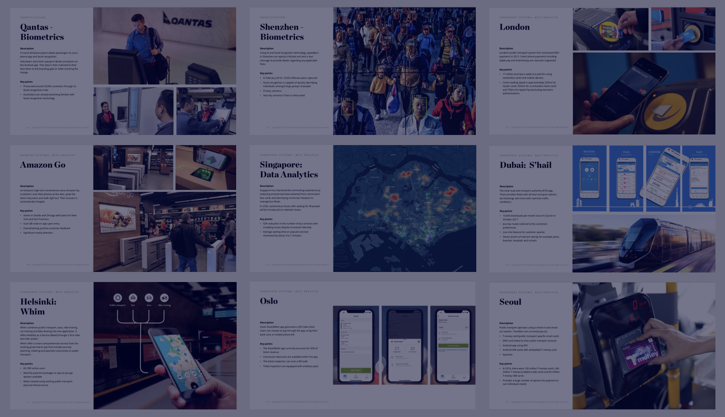
Takeaways: We were inspired, amused and everything in between! There’s a lot going on… From Uber to Oyster, Google Maps to Citimapper.
Inspiring:
- “Be-in, Be-out”: Amazon Go’s new way to pay for groceries without having to physically pay
- Google maps in Japan shows fare prices for public transport
- Citimapper is using smart data to optimize travel routes (and even trialing introducing a bus service that will rival London’s traditional double-deckers!).
Amusing:
- Citimapper’s public transport app lets you choose ‘JetPack’ as a mode of public transport. Wonder what happens if you do?
Slightly creepy?
- In Shenzhen, jaywalkers are being fined using A.I. and facial recognition technology. Offenders will get a nasty text message, and if applicable that’s how they get their fines too.
Reviewing Existing Documentation
A lot of existing documentation had been supplied by our client. Business requirements, Personas, Prototypes and more… and although unexpected, it was a helpful base for us to build on.
Pros: We hadn’t expected any of this groundwork to be done for us, so our workload was somewhat reduced. Also, our client had recently completed a similar project in the USA and had some old Invision and Sketch prototypes for us to have a look at. And while it’s never safe to assume that what works for another product will work for yours, they did help us to see how similar U.X. and I.A. problems had been resolved elsewhere.
Cons: Some of the documentation was inaccurate — the Business Requirements were up to 5 years old and there were some discrepancies — but our Business Analyst spotted these quickly fixed them up with our client.
Workshops: Co-designing The Future State
When we first pitched for the work we promised our client:
“Our multidisciplinary project team will design with your people, not just for them”
We were about to re-shape the future of public transport in our city, and the entire state — so we needed all the expert input we could get and workshops are a great way to do this.

Kickoff Workshop
Kicking off at 9 O’Clock sharp, we held an intensive all-day session to understand what the expectation was internal, any potential risks, and which areas of the business might be affected by all the change that was about to get set in motion.
In total, we had over 20 enthusiastic people in the room — all ready to roll up their sleeves and dive in. And having so many stakeholders invested was great, but definitely needed some careful planning!
The last thing you want is a workshop where people aren’t engaged, so it’s vital that the workshop is well managed and everyone is able to feed in their perspective.
Activities we facilitated:
We used a mix of different activities throughout the course of the day to keep everybody focussed and engaged.

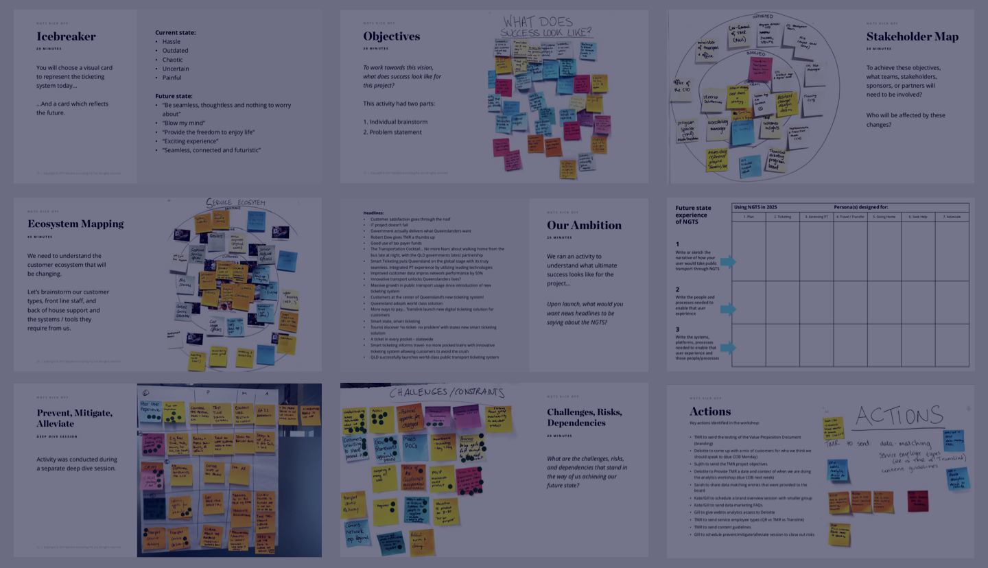
Ice-Breaker
At the start of a project, an Ice-Breaker activity is a good way to set the right atmosphere so everyone feels comfortable enough to share their thoughts.
Running the Ice-Breaker:
- We printed about 100 public transport relevant, thought-provoking images and lay them out on the table.
- Next, we asked everyone to choose an image that represents the current state today, and one that represents the future.
- Everybody then had a few minutes to explain their choice in front of the group.
Some people shared funny narratives whilst others were more serious — but now we were ready to get into the core workshop activities.

Activity #1: Definition Of Success
We asked stakeholders: “To work towards this vision, what does success look like for this project?”. Everybody took a few minutes to get their thoughts on post-it notes.
An example from a Project Manager was “Tangible deliverables tied to delivery phases” or one from the Customer Experience perspective said, “customers telling us what they need”.
Everyone had their own perspectives and this was a great way to capture them.

Activity #2: Stakeholder Map
We asked everyone “To achieve these objectives, what teams, stakeholders, sponsors, or partners will need to be involved, and who will be affected by these changes?”.
Again, thoughts were noted on post-its and a group discussion followed. We grouped all the post-its into 3 categories:
- Core team
- Involved
- Informed (aka not directly involved)

Activity #3: Service Ecosystem Mapping
We needed to understand the ecosystem that we would be changing, and consider what tools different user types would need from us. Customers, Frontline staff, and Backstage staff would all need to be considered — so we added our considerations to post-its and stuck them up for discussion.

Activity #4: Front Page Headline
To understand stakeholder expectations in more detail, we used context and images as triggers. The front page of an online newspaper seemed like a good prompt!
We printed out a few copies per person and handed them out to the group. Everybody chose the image they thought was most relevant and crafted their own ‘future state’ breaking news headline.
Our favorite was “Improved customer data improves network performance by 50%.’’
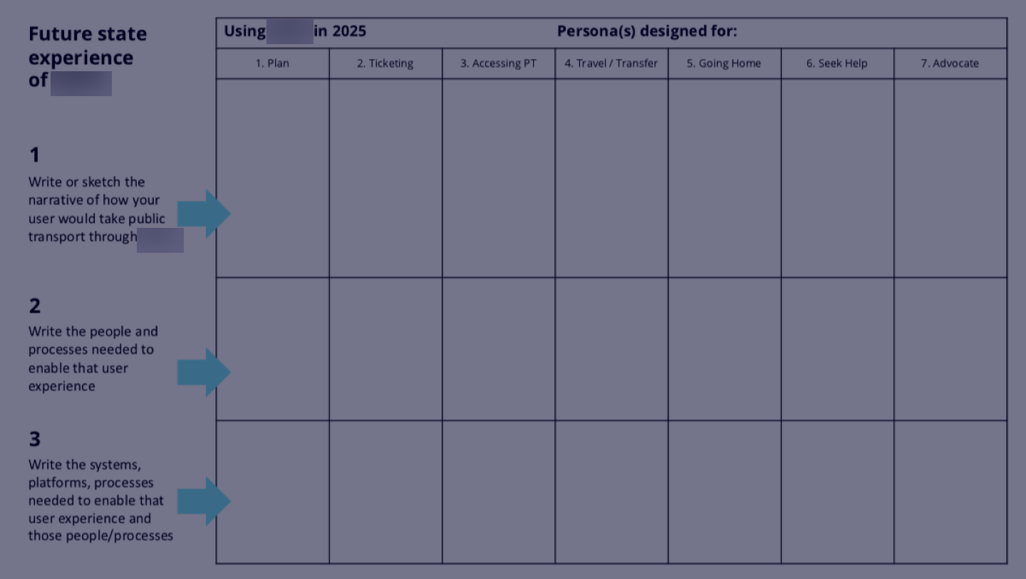
Activity #5: Future State Elaboration
To start defining the stakeholder’s vision for the future state customer experience, we handed out the template shown above. Each person was asked to describe their ideal journey in relation to a chosen persona and the 7 stages of travel they would experience.
It got everyone thinking about the people and processes needed to enable that user experience, and the systems, platforms & processes needed to enable that user experience and those people/processes.
Lots of information — but crucial! These were the core building blocks of the Service Blueprint that we delivered at the end.

Activity #6: Challenges / Risks / Dependencies
To set ourselves up for success we needed to understand any potential blockers.
We asked ourselves and stakeholders “What are the challenges, risks, and dependencies that stand in the way of us achieving our future state?”.
After getting our thoughts up on the wall, everyone got 3 sticker dots and voted on which areas they thought were most critical.
The standout has to be “Risk: not enough gangster rap killing my vibe” 😂 but another very real example was “Risk: designing a solution that isn’t advanced enough, and it’s old as soon as it launches”.
The speed of technological change is real!

The Actions Board
Space were actions were recorded.

Outputs From The Kickoff Workshop
Each activity had produced an invaluable set of insights — but the key to the next step lay in the outputs from the ‘Future State’ activity where everyone had contributed what they thought an ideal future state experience would look like.
Now we needed some way to test if our stakeholder’s vision matched what customers expect the future to look like. For this, we mapped out some hypothetical future state customer journeys…

Future State Customer Journeys (Our Hypothesis)
At the end of the Kickoff Workshop, we had chosen 3 user types to focus on. Although 13 personas existed, that was far too many for this 9-week project!
Main user types:
- Frequent travelers
- Infrequent travelers
- Varied ability travelers
The benefit of focussing on just 3 users types is that it targets the highest volume of public transport users and so will improve the experience for most. The downside is that some user types (Eg: Tourists) are not fully considered.
But the timelines were tight, so by limiting the scope it meant we could be effective in the areas where it counted — and leave the rest of the research to be done in the next phase of the project.
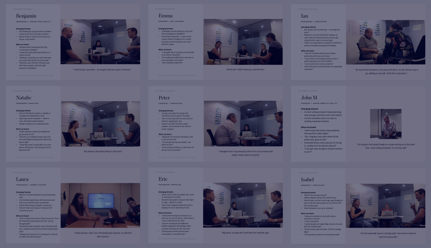
Customer Interviews
So with an agreed scope, we set about getting our 15 customer interviews lined up.
We needed to recruit participants for the 3 agreed categories (Frequent, Infrequent, and Varied Ability) who were also as diverse as possible so as to reflect the real world.
We starting looking for:
- Frequent travelers (2 to 5 days per week)
- Infrequent travelers (once or twice a month)
- Mobility impaired
- Sight impaired
- Living in the CBD
- Living at least 500km from the CBD
- Is a Student AND has a student discount applied
- Is a pensioner AND has a pensioner discount
Challenges
We planned to do all the recruiting ourselves. Between us and our client, we had people we could call on to take part in the study and there’d be no need to pay incentives or recruiters.
We started by interviewing employees from our company, but 3 interviews later we saw that all these professionals were providing some really smart insights. Too smart! Our colleagues didn’t represent typical users and it was skewing the data. We needed to change our recruitment approach…
We called our client and explained that we were going to fall behind schedule if we didn’t start using a 3rd party recruiter. And if interviews fell behind, subsequent activities would be put at risk too.
So with the whole team on board, we started using a remote recruiting service called Askable and quickly got back on schedule.
This tool was really helpful in automating the recruitment process. It handled everything from scheduling to incentives — and allowed us to select our own participants based on our project’s needs.
So although we had lost a day or 2, we ended up winning by interviewing a more diverse set of demographics than we might not have found without resorting to using Askable.
So what’s the key takeaway here? Every cloud has a… quick recruitment solution? 😂
Running the interviews
Our interview setup
Sessions: 90-minute face to face interviews
Team: 1 x participant, 1 x interviewer, 1 x (very attentive) note taker
Tech: Recorded on video using a MacBook Pro + Quicktime
Location: Client site, in a decent-sized meeting room with refreshments
Note: For some sessions, we decided to do simple 30 minutes Q&A over the phone — this suited some user groups eg: participants more than 500km from the CBD.
The interviews were split into 2 parts:
Part 1 (45 mins)
A face to face Q&A to learn about the user’s past experiences, future expectations, pain points and things they enjoyed most about public transport in our city.
Part 2 (45 mins)
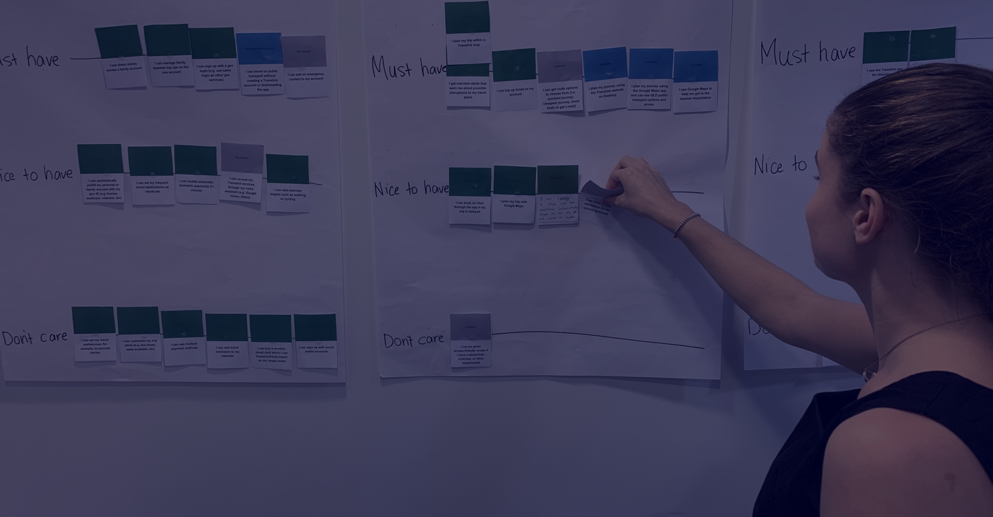
A custom activity is similar to a Closed Card Sort, where we asked users to prioritize app/website features across different stages of the customer journey. Features were prioritized into 3 categories:
- Must-Have
- Nice to have, or
- Don’t care
The activity came out of the Future State Elaboration activity from the Kickoff Workshop. We had printed all of the features that stakeholders contributed during the workshop and grouped them according to which stage of the customer journey they applied.
This formed our hypothesis for Future State Journey Map. But now we were going to take it a step further with users and validate it our thinking.
What we had defined was only what we thought customers would love — not what they had actually expressed their interest in. So running this Closed Card Sort activity with users now helped us to validate or disprove our thinking.
After a few interviews, we started to see which features appealed to users and which ones they didn’t care for. Some features were more relevant to one type of user than they were to the other — these insights would help us to create a Future State Journey Map for the 3 different user types.
The Closed Card Sort was also a great conversation starter around each of the different features we had proposed. We could start to deeply understand the user’s motivations for liking or rejecting them — and we even came up with some new considerations as conversations progressed!
Making sense of it all
We now had run a total of 15 interviews and had masses of data to sift through and organize into a useful format.
The notes that were taken by our note takers would form the Affinity map, and the Closed Card Sort outputs would be turned into a prioritized list of features for the app and website of the future.
Feature prioritization
From the Closed Card Sort, we entered the position of each feature into a spreadsheet that quickly gave us a birds-eye view of which features were seen as most important (Must Have) at different stages of the journey.
Top insight: Our most interesting takeaway reminded us to “pay attention to what users do, not what they say”.
When we asked participants “Do you use any online services to manage your [payment] card?” — almost all of them said they never go online, nor do they want to.
But in the Feature Prioritisation exercise, account management was a feature that came out top among the almost 80 that we had listed. Sounds like a contradiction…
But, what we learned is the reason they don’t go online (or want to go online) is because the card readers on the bus or train show the account balance when they pay — and this provides enough peace of mind that they don’t see a need to monitor their spending online.
But for essential management like adding funds or enabling auto top-up, account management is essential. And this is why it ranked among the top in the Closed Card Sort.

Affinity Mapping On The Wall
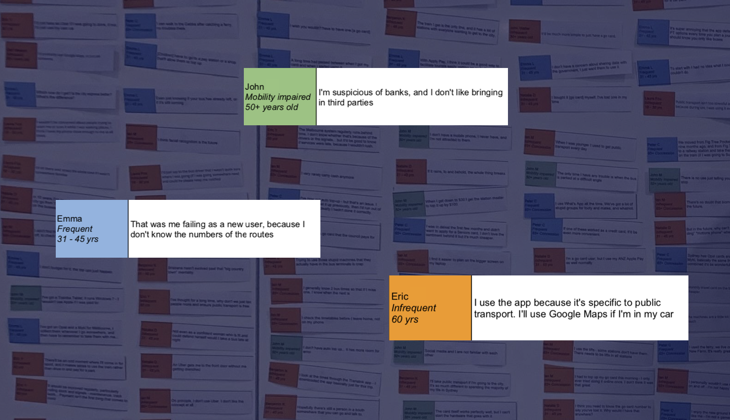
The goal of creating an Affinity Map is to find themes in anything that was said during customer interviews. Sticking all of the data up on a wall makes the process a lot easier — and invites debate among the team for a more robust set of groupings.
Here’s how we created ours:
- Sift through the interview transcripts and copy the most pertinent quotes into a Google Sheets template (so you can all collaborate — many hands make light work!)
- Print and cut each individual quote out to stick up on a big open wall
- Move each quote to the stage of the journey it applies to
- As you’re working through all the quotes, you’ll start to see themes in sentiment emerge
- Group quotes of a similar theme into their own groups and give them a title (these become the ‘key insights’)
- Write a single statement that captures the sentiment behind all of the smaller groups within each stage of the journey (these become ‘Design principles’)
- Capture it all in a spreadsheet — you now have a draft Customer Journey Map!
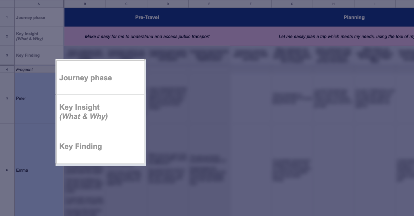
It might seem like a lot of work but it’s really worth it! When there’s so much data you need the space and freedom to see everything at once. A screen or even multiple screens are just too small and don’t allow the same level of collaboration and debate that physical space does!
Tip: during interviews, our note takers had captured everything word for word and that allowed us to create an accurate affinity map.
Customer Journey Map With Real User Data
By consulting with users, we had now validated our approach. All of the proposed features that Stakeholders and our team had fed in at the beginning, had either been proven or disproven — and ranked by the users of the current public transport system.
We presented the first draft and explained what the document was, and what it wasn’t.
It was: A first draft for communicating a high-level ideal journey for 3 of the main user types.
It wasn’t: Extensively detailed, nor was it a final deliverable.
The main purpose at this stage was to have a check-in with business and technical stakeholders and check that we were on track, meeting stakeholder expectations and delivering what was technically feasible.
It was also an opportunity to highlight some new requirements that had surfaced during interviews and get feedback from the group.

Analytics & Personalisation Strategy
We now had a direction for our product’s design with some emerging themes and customer-validated insights. And an increasingly popular trend in digital products is personalization — but who plans all of that out?
Strategic approach
A member of our team from Cognitive & Analytics helped to define key personalization opportunities and what types of data would need to be collected to realize the vision.
Our client needed to know enough about their users to be able to give them personally relevant information at the exact time and place that they need it.
For example: What if the app knew exactly which bus users took regularly and only notified them when that one was delayed?
These were the types of moments in the user’s experience that we were trying to define, and we started to build a strategy to realise it.
Success measurement framework
But while the richness a user will experience through personalization is great, how will it add value, how will uptake be measured, and what will success look like?
We conducted a separate workshop activity to gauge high-level metrics both for customer and personalization feature success.
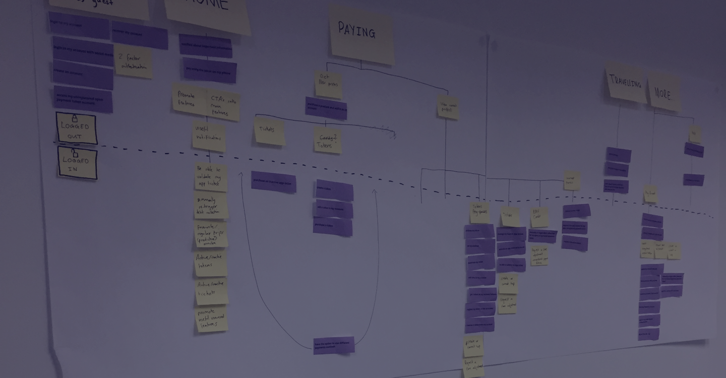
Defining The I.A. For Both Platforms
By now we had heaps of user data, a draft Personalisation Strategy, and a draft Future State Customer Journey Map. We also had an existing list of business requirements and new feature requirements that had come out of customer interviews. The next deliverable was a concept information architecture (I.A.) for the website and mobile app.
Researching competitors including Transport for London’s ‘Oyster Card’, our city’s current public transport payment method, and some other ticketing system portals gave us a good idea of how users might expect our I.A. to be structured.
Armed with this knowledge we printed out all of the business requirements and stuck them up on the wall so we could quickly start to draft out an I.A.
Again, like in the previous activities, having them in a physical form made it easier to discuss as we worked. We didn’t spend very long on this — just over 1 day was enough to consider level 1 and 2 items, with level 3 covered by a list of example pages.
Note: This was just a concept I.A. which hadn’t been tested with users. A fully considered I.A. needs to be tested and validated to make sure it’s fully understood by all.
Selecting Which 15 Wireframes To Create
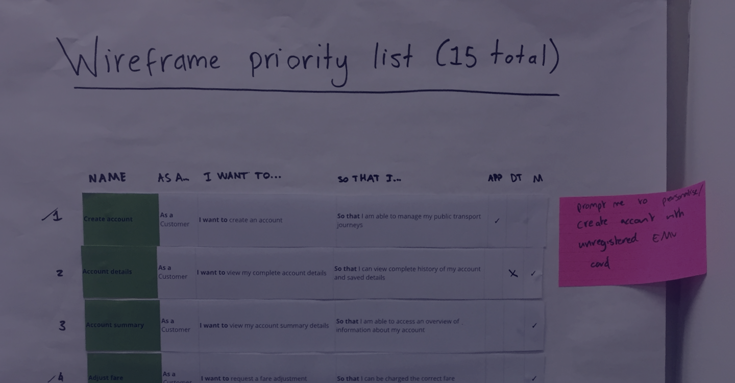
In our original Statement Of Work (S.O.W.) we had agreed to deliver 15 wireframes to help bring the Future State Journeys to life. We now needed to select which features or user stories those wireframes were going to focus on.
A collaborative approach
In a collaborative workshop, we facilitated a prioritization activity where stakeholders selected the top 15 user stories to wireframe based on overall business value.
We defined user stories as being valuable if:
- They were likely to be built within the next 12 months and weren’t so futuristic that feasibility was still unclear.
- Features had consistently been ranked as ‘Must-Haves’ in customer interviews (we had this data in a spreadsheet).
Once we had chosen the top 15 we ran an elaboration activity for stakeholders to include any extra information (eg: fields, design considerations, or key functionality) to inform the design process. This helped us to fill in some missing details for business requirements — important because some requirements were up to 5 years old!
Wireframe feedback
The first round of feedback was really helpful to stakeholders who could now see the requirements in a tangible form. We debated, discussed, and collaboratively defined how we felt the future of public transport should be delivered to customers.
Key learnings
- It can be hard for stakeholders to articulate the exact requirements of a future state product until they see something tangible in front of them
- Wireframes spark debate and discussion — and help to formulate a clear set of requirements
- Stakeholders appreciate the clarity that wireframes bring to conversations
- It was hard to create just 15 wireframes without considering how the rest of the product would work around that particular screen. We ended up delivering way more than that!
- Using a wireframes toolkit really sped things up — highly recommended!
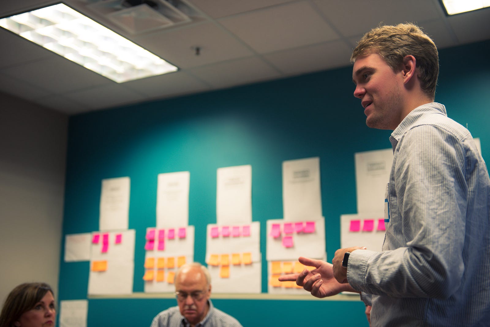
Creating The Final Service Blueprint
Our draft Customer Journey Map that we had co-created and validated during the course of the project now took center stage.
We started filling in all the details that we had collected through documentation, interviews, and workshops, to transform it into the fully-fledged Blueprint that it is today!
The Blueprint now represents an aspirational view of the end-to-end future state traveler experience. It covers a lot of detail, including:
- Conceptualized traveler experience across key journey phases
- Differences in the experience for infrequent and varied ability customers
- Relevant business requirements
- Personalization opportunities
- Onstage and backstage experience
- Future considerations
Journey Phases:
The Blueprint details elements of the experience across all stages of the journey, including the following:
- Pre-Travel: How the customer interacts with the system before planning or taking public transport.
- Planning: Steps the customer may take to plan their journey, if they deem planning as necessary.
- Travel to Station/Stop: The period of travel the customer takes between their home and public transport.
- At Station/Stop: Experiences the customer may have in waiting for their public transport service.
- Start Trip: How the customer starts their trip on public transport (with a focus on payment).
- Travel: Events that may occur whilst the customer is traveling on their journey’s required service(s).
- End Trip: How the customer ends their trip on public transport (with a focus on payment).
- Manage Account: Ways in which the customer may wish to manage their account or payment methods.
Delivering the blueprint
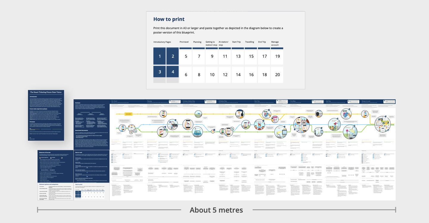
One risk of creating such an incredibly large and intricate document is that no one ever reads it, and your hard work is lost. So we made the document more consumable….
Using Powerpoint we created a multi-page template where each page links to the next and fits together like a big puzzle. This way clients could print it in large format, or email it around as a multi-page PDF. Brilliant!

Final Showcase
The final showcase was where we got to present all the hard work we had done up to this point, and deliver a set of future recommendations to help our client take the plan successfully into the next stage of the project.
When we presented back, the narrative always framed everything in the context of Horizon 1, Horizon 2, and Horizon 3. This was referring to the iterative approach of delivery and the way that different features would incrementally be released over time.
We walked out of the presentation feeling really proud of our work, knowing the value that we had delivered — which was confirmed when we got a warm thank you email (below).

Final thoughts
We all learned a lot from the project and each one of us had outdone themselves in some way. Our clients were happy, we were happy — and most of all — we had kept users at the centre of everything we had done.