Introduction
After leading 2 smaller projects at Woolies (Recipes & Ideas Navigation redesign, and Product Recommendation Engines) I was given the exciting and challenging opportunity to lead the end-to-end User Experience Design for the ‘Bundles’ project; a long-overdue introduction of mix-and-match style combination deals to the Australian market.
My role
UX Design Lead responsible for the end-to-end user journey, including stakeholder management, requirements gathering and prioritisation workshops, wireframing and journey mapping, customer research and delivery of detailed UI designs.
Supported by 3 Senior Designers and 2 Technical BA’s, collaborating with 4 Product Managers, a Senior Marketing Manager, 2 Technical Leads, an Agile Delivery Lead, and many talented back and front-end Developers.
Why Bundles, now?
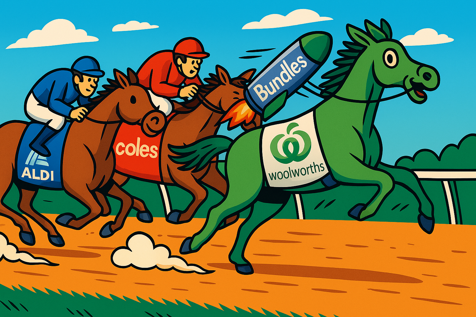
Woolworths gaining a competitive edge in the 3-horse race
There are a few reasons why it makes sense to pursue Bundles right now…
Project requirements
While we knew more or less what we were trying to deliver, we only had a few “firm” requirements at the start (although these changed and evolved as the project progressed).
Knowledge gaps
Everything else, from refunds and substitutions rules, to detailed edge cases, out of stock and display rules, were up to me and the team to validate with the relevant stakeholders.
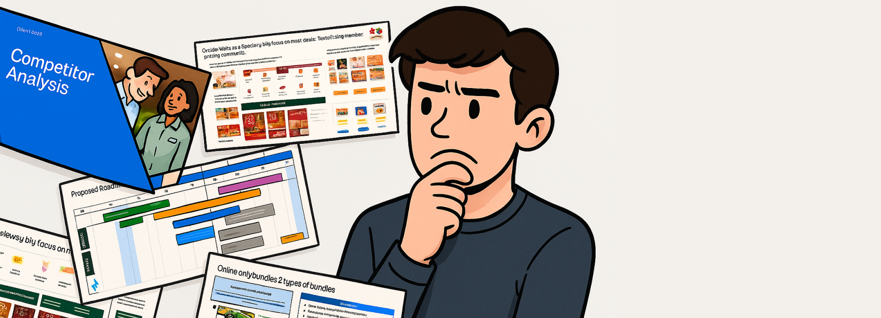
Design process
In an organisation the size of Woolworths there was a lot to get my head around, but I drew on my experience from working on similar projects at Woolworths to work through the problem step by step.
Kickoff prep
I did as much pre-work as I could ahead of the kickoff so it would be a productive session…
Review existing research & strategy packs
Working with the core stakeholder group, I started to understand the problem space by reviewing existing materials from when the initiative was first pitched to senior leadership.
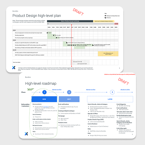
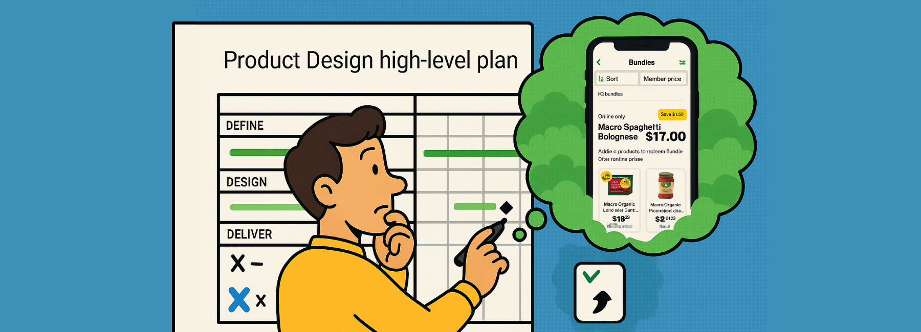
Project plan
I drafted a plan on a page to share my planned approach and get input and early alignment. The plan split the work into Define, Design and Deliver swim lanes with milestones and key meetings planned.
Concept IA
To get my head into the details I developed a concept IA for Web and App to visualise the full potential of what Bundles could scale to longer term.
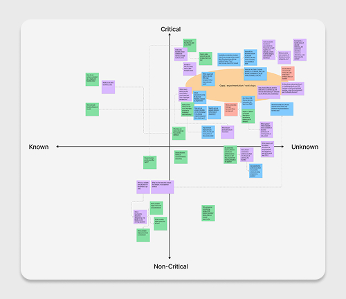
Key questions for kickoff
As questions came up, I prioritised them by mapping the unknowns and identifying who from Design, Technical, Product, and Legal could help answer them.
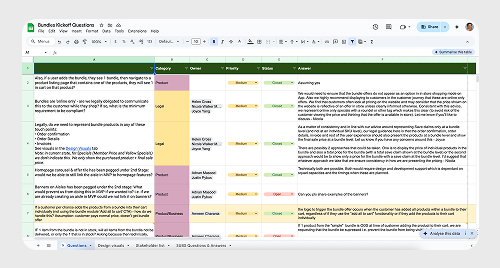
Ongoing FAQ’s list
Before the project gained too much momentum, I documented some FAQs in a spreadsheet to protect my time, and help facilitate deeper understanding across the project.
Competitor research
Looking at local and international competitors, I could see best in class, to manual and clunky Bundles – and where our opportunities were to do better.
Competitors like Ocado, Sainsbury’s and Waitrose in the UK were well-established. Closer to home, Coles and Harris Farm were exploring Entertaining and Gifting Bundles.
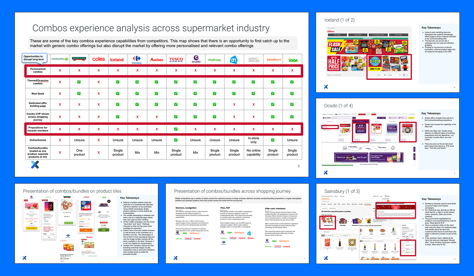
Key insights
✅ Common approaches
- Meal deals are the most popular type of Bundle
- Savings are explicitly called out
- Supermarkets visually signify which products are part of a Bundle on Product Tiles
❌ Opportunities
- Bundles are often presented on their own landing page, where the customer must manually add all items to Cart to redeem the offer (this leaves room for error, and adds cognitive load to the experience)
- Bundle products are not intuitively grouped in the Cart
🔦 Takeaway
There are many established patterns for shopping Bundles and Meal Deals, but all of the approaches we found left a lot to be desired in terms of user experience and ease of use.
Current state analysis
Knowing that Bundles would effectively be a new type of special (of which Woolies has many types, each with its own user journey and touch points) I spent some time reviewing existing Specials & Offers touch points.
The key question we aimed to solve by going through this process was:
How might we surface Bundles by reusing parts of the existing Specials experience in Product Tile middle messaging, signposting in the Cart, executions in the Invoice, eReceipt, etc?
🤔 Challenge
Woolies Web and App experiences are not always consistent (eg: Checkout is different between the two), so immediately this added complexity to any potential reusability of existing touch points.
🔦 Takeaway
While there was precedent on Woolies App and Web for shopping Specials and despite stakeholder desire to re-use and repurpose, there were several new edge cases which we would need to design and build from scratch to deliver an acceptable user experience.
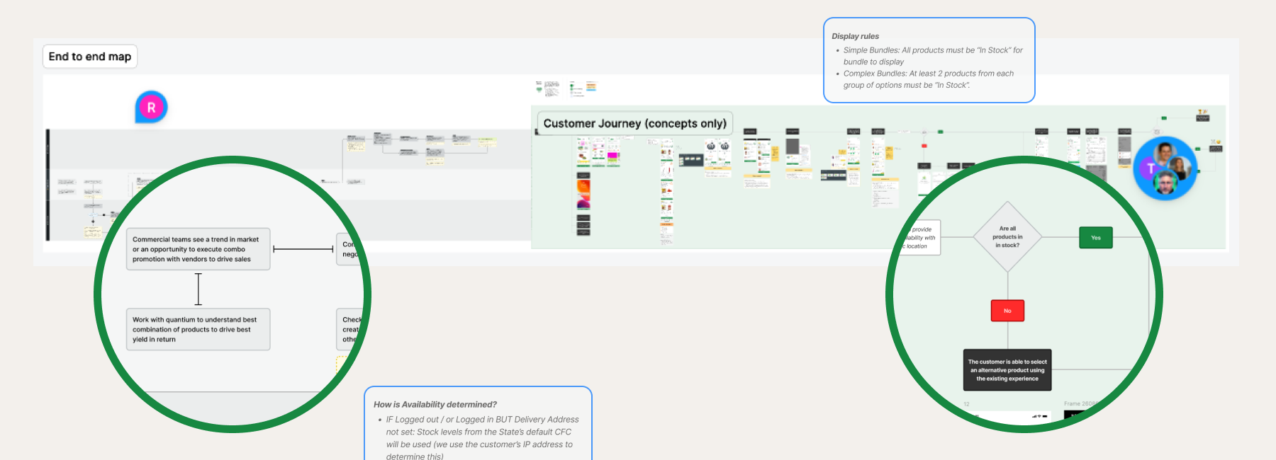
Journey and process mapping
Using the Concept IA I had developed earlier, I drafted an end-to-end journey map with quick App screen mockups to facilitate discussion, firm up requirements, onboard, and align multiple team members, stakeholders and squads.
Working with Merchandising managers, I extended the journey map out to include the offer creation process.
Iteratively developing designs
While the End-To-End customer journey helped to facilitate discussions and solidify requirements, various communication channels helped the team stay in close contact.
How we collaborated
Slack channel
The Bundles-Working-Group Slack channel enabled asynchronous collaboration
Relationships
I kept open lines of communication with key Tech and Commercial stakeholders.
Design checkins
Allowed designers to share learnings, answer questions, and collaborate.
Tech checkins
Weekly reviews allowed ensured designers we were always aware of any technical constraints.
Scrum-Of-Scrums
I initiated a Weekly touchpoint for squads to stay in sync and raise any dependencies.
Design highlights
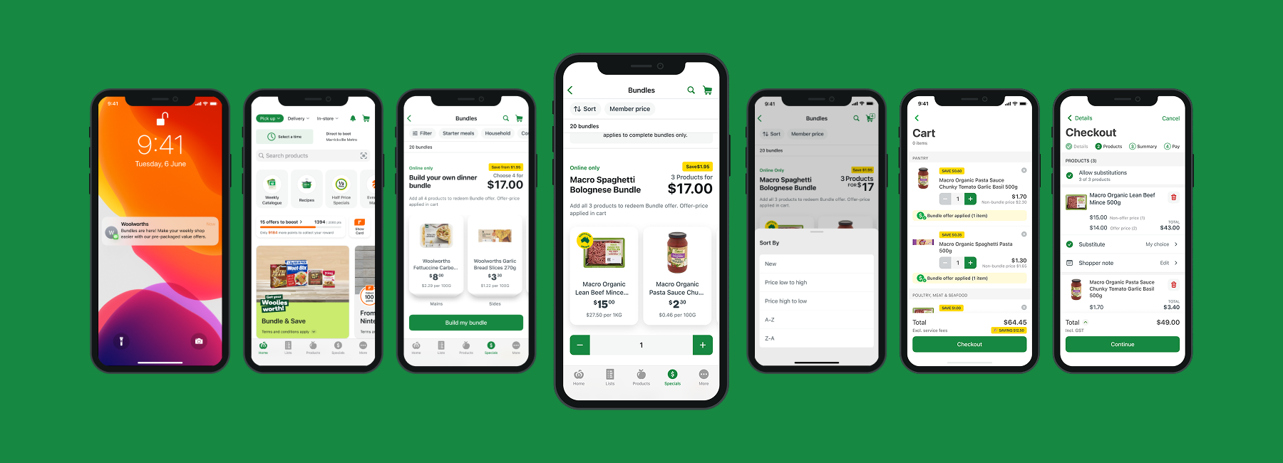
As our requirements became clearer, I started to draft higher fidelity designs for Web and App. Some highlights:
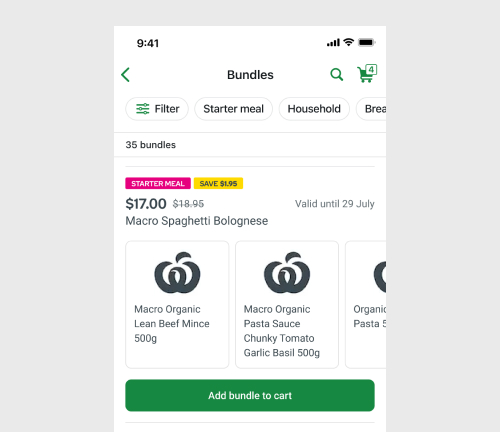
Landing page
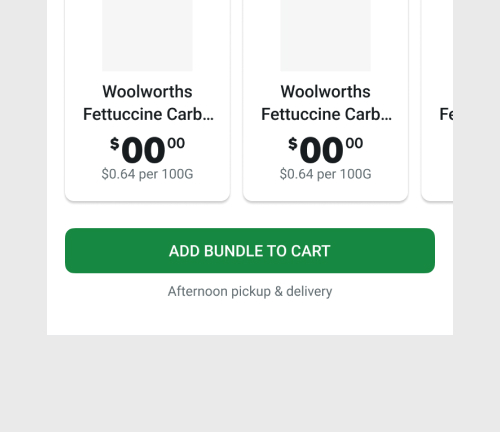
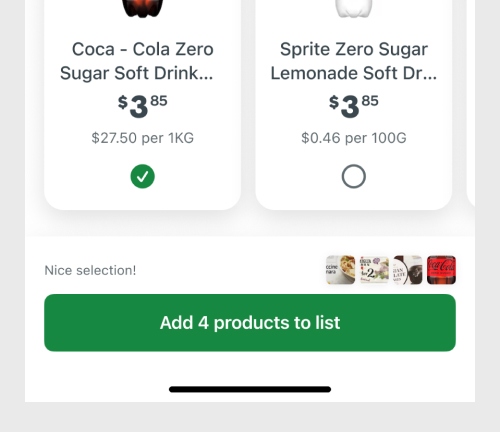
A Home for Bundles that lives in the Specials section. As the number of Bundles scales, the ability to add in category filters. The single tap ‘Add to Cart’ CTA is designed for convenience.
Simple bundles early layouts
I spent some time exploring different placements for the price tag – should it go next to the ‘Add to cart’ CTA, or up near the title?
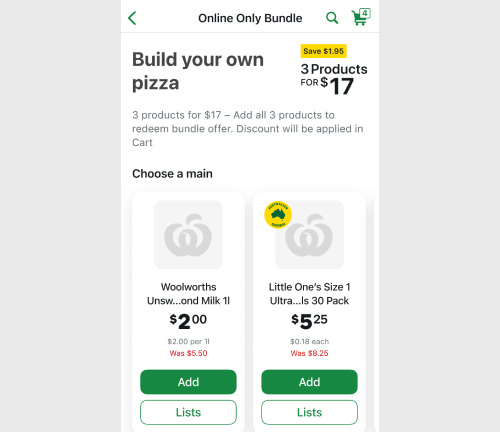
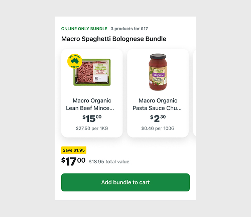
Complex bundles
An earlier iteration of the Complex Bundles that allows customers to add uneven quantities of products to their bundles.
Product Detail page
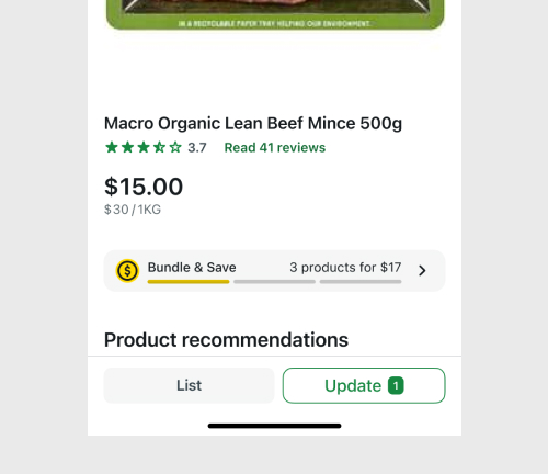
A potentially high impact entry point for Bundles would be to add a CTA to Product Details pages, so customers would be alerted to any bundle offers available for that product.
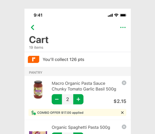
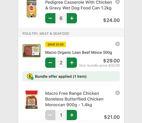
Cart
Deciding whether to group bundle products vs listing them individually in the cart. Each approach has technical and legal pro’s and con’s.
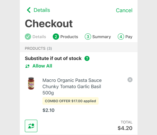
Checkout
Current experience across web and app is inconsistent which adds to the complexity of designing a legally compliant solution.
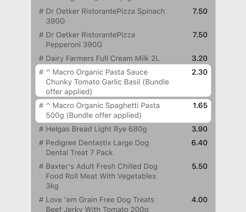
Invoice
Making changes in this space requires a lot of back-end changes on legacy systems, and we explored several approaches, collaborating with Tax and Legal on the final solution.
Legal and technical tradeoffs
While we had some creative freedom on details like pricing layout, in other cases we were strongly guided by Legal and Tech to mitigate any obvious risks.
A Legal example… Pricing transparency
Depending on your product selection in a complex bundle, the amount a customer saves will vary – so we needed to decide which approach would be less likely to mislead a customer and provide the greatest pricing transparency. We debated…
Do we: risk overstating the Save amount, or do we rather understate the total value of the Bundle by showing a lower Save amount?
It got pretty complicated – but we agreed on an approach to show a ‘Save from‘ amount.
Some Technical examples
❌ Unlimited Bundles: Publishing an ‘unlimited’ number of Bundles raised page load time performance concerns, so we limited initial launch to a maximum of 20 bundles.
❌ Filtering: Filters also added a lot of complexity due to the way products were grouped and the lack of relevant category metadata, so we made the call to go without until the larger number of Bundles warranted the need for filtering.
❌ Grouping bundled products in the Cart: This was seen as more desirable in testing, but added complexity to the build, so we designed a way to display products in the existing Cart design which was also legally compliant.
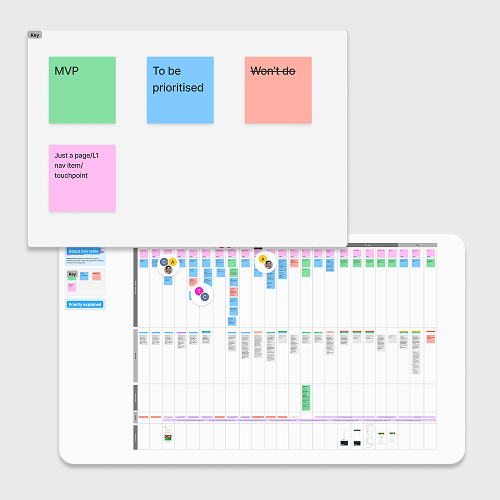
Prioritisation for delivery
By now we had developed concept designs for the end-to-end experience and had a clear view of what the Bundles proposition could scale to, but to move into Delivery we needed to work through the details and prioritise every touchpoint. These conversations were guided by a few questions:
My Project Manager and I reviewed the end-to-end journey through these lenses and prioritised all of the touch points into 4 delivery ‘Drops’.
Delivery phases:
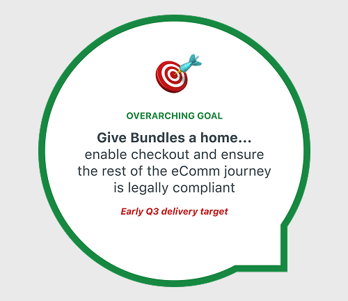
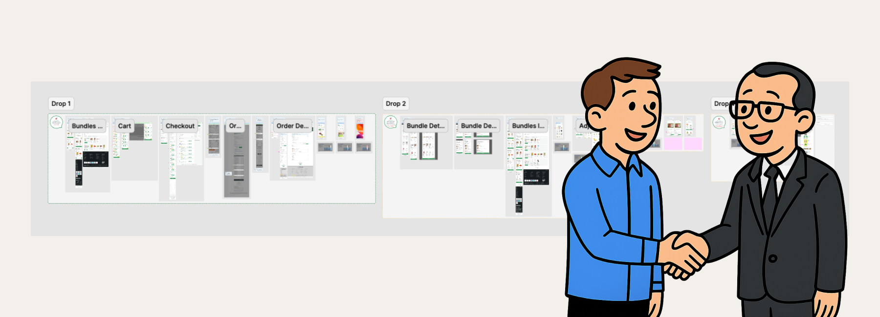
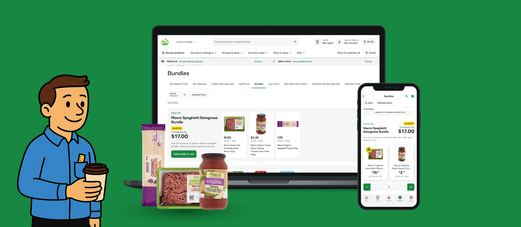
Drop 1
Touch points include Homepage, Bundles Landing page, Push notifications, Cart, Checkout, Invoice, Order confirmation email, eReceipt, Order Details.
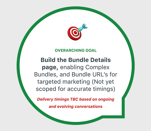
Drop 2
Introduce Complex Bundles, Bundle Details Page (for Simple and Complex Bundles), Display in Catalogue and adjacent Aisles and Categories.

Drop 3
Enhance the Cart experience, Add CTA’s to the Product Detail page, and Middle Messaging to Product Tiles in the browsing experience.
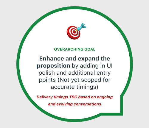
Drop 4
Display in Search Results, Aisles and Category pages, and add in any UI polish that was missed in earlier builds.
I circulated a WIP update pack with the agreed scope presented visually, a high level Delivery plan, and other crucial information for the broader business to be aware of. With our scope confirmed for Drop 1, the design team commenced Detailed Design.
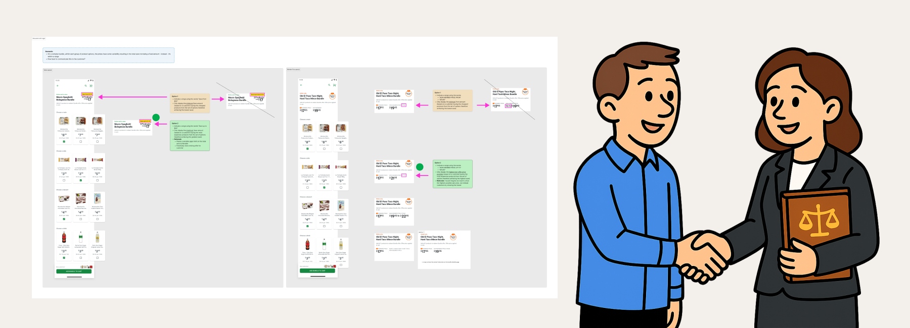
Designing for edge cases
While we spent many hours refining interactions and user flows, a significant portion of our focus was also spent addressing edge cases—numerous in a product with such intricate logic and so many dependent processes!
2 different prices
When a product is sold at 2 different prices (1 x bundle price and 1 x not part of a bundle, so at full price) how to display this in Cart, Check, Invoice, Order Confirmation email, EReceipt
Restricted items
Applicable to products such as knives (over 18 only) Roasted Chickens or Bakery items (only available in the afternoon) or other products which are not available in remote areas.
In-store mode
In-store mode doesn’t have a Cart, so how would Bundles appear in Lists, and how would this impact the existing build?
And many more examples: Unequal product quantities (eg 1 mince, 1 sauce, 2 zucchini, 1 spaghetti), Weighted quantities, Bundle has Booster products, Loading states, Bundle unavailable, Bundle limit reached, Product limit reached, Cart – ‘breaking’ a bundle by deleting one product – customer loses discount.
Customer testing methods
Throughout the process I partnered with the Customer Research team to conduct research into different aspects of the experience.
Quantitative
Using the KANO method I was able to quantify the difference in desirability between different landing page designs, pricing layouts, and proposition names for Bundles (ie: Bundles vs Combos vs Bundle Offers etc).
Qualitative
1:1 moderated user testing of the end-to-end journey, to validate that the Bundles UI and user journeys were well understood, including probing into some other areas such as…
Bundles construct
Do customers understand the overall Bundles concept?
Pricing and Save amount
Do customers understand the offer price, Save amount?
Value perceptions of Bundles
Do customers see value in the example bundles?
UI microcopy
Is there anything that is unclear?
Desirability of different Cart designs
Do customers prefer grouped vs ungrouped?
Key findings
✅ We validated
- Offer redemption: All participants understood how to redeem the Bundle offer
- Landing page design: The variant with a one-click add to Cart:
- Requires less cognitive effort and was most desirable
- Is perceived as more valuable, offering more convenience and more relevance
- Is perceived as being more usable
- Bundle clarity and value: All participants demonstrated a clear understanding of bundle savings and their perceived value.
- Preferred pricing lockup: The most desirable from 4 options was validated
- Naming: The most desirable from 4 options was “Bundles”
🤔 We learnt
- Discounts: Participants expect a price discount of at least 20% on Bundles. Smaller discount amounts were not seen as a substantial enough saving to entice customers to buy all products in the Bundle.
- Cart: Participants expect that the Cart and Checkout will look different after they add bundles to cart in one click. They expect them to be grouped, although they all understood the way we had designed the Cart for Drop 1.
- Navigation: Participants wanted to be able to view each product’s detail page from the landing page.
Supporting the Architect
Alongside user testing, creating stakeholder packs, and executing UI designs, there were other jobs to be done including onboarding new capabilities and clearly communicating requirements to everyone involved. When the Solution Architect joined the project, I worked with our Technical BA and ADL to summarise all high level requirements on to a single page in Confluence.
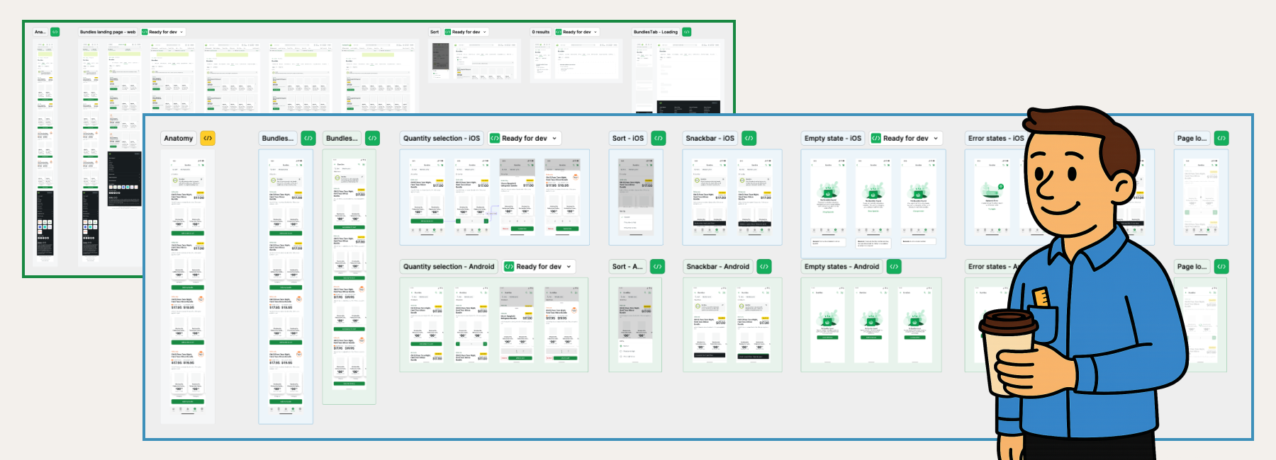
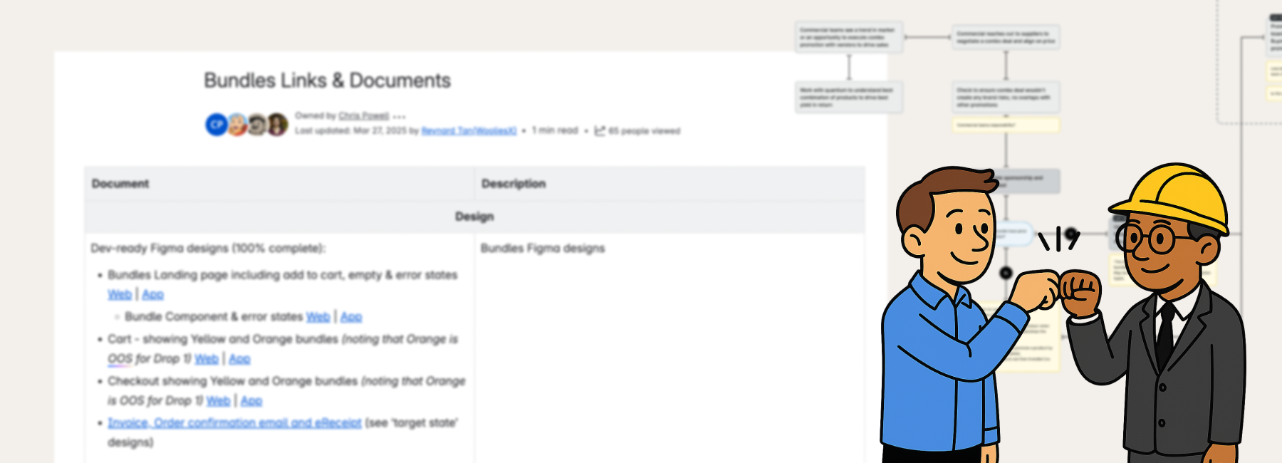
Dev-ready designs
Myself and the other 3 designers executed the dev-ready designs for Drop 1 across App and Web, dividing the work across our relevant remits and specifying every detail from interactions down to accessibility requirements.
I was able to leverage the existing Woolies Design System for the majority of screens, and sought feedback from other designers at weekly design crit’s to ensure any new patterns were aligned to other in-flight work.
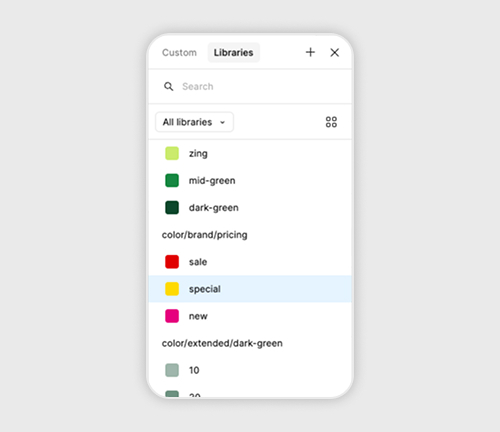
CORE Design system
I was able to leverage the existing Woolies Design System for the majority of screens, and sought feedback from other designers at weekly design crits to ensure any new patterns were aligned to other in-flight work.
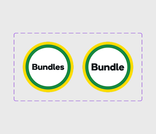
Roundels
Bundle vs Bundles; we needed a singular version for Bundle Detail Pages, and a plural version for navigation tiles.
Micro-copy
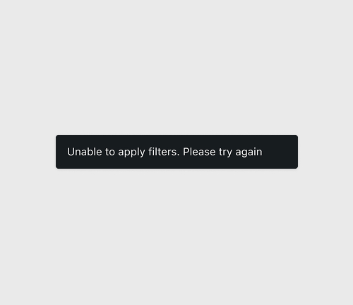
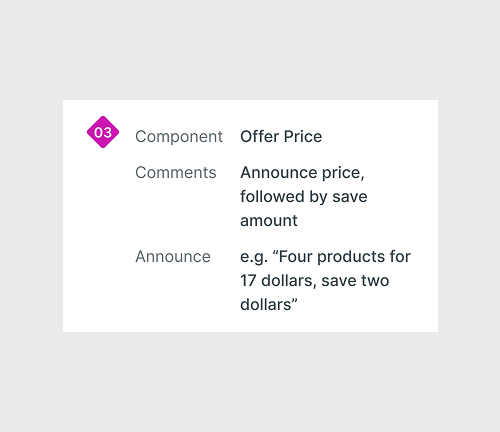
I tweaked and refined any error messaging displayed across the user journey to be short, functional and helpful wherever possible.
A11Y specifications
I documented the reading order for assistive technology and collaborated with front-end developers to test and tweak until the experience felt right.
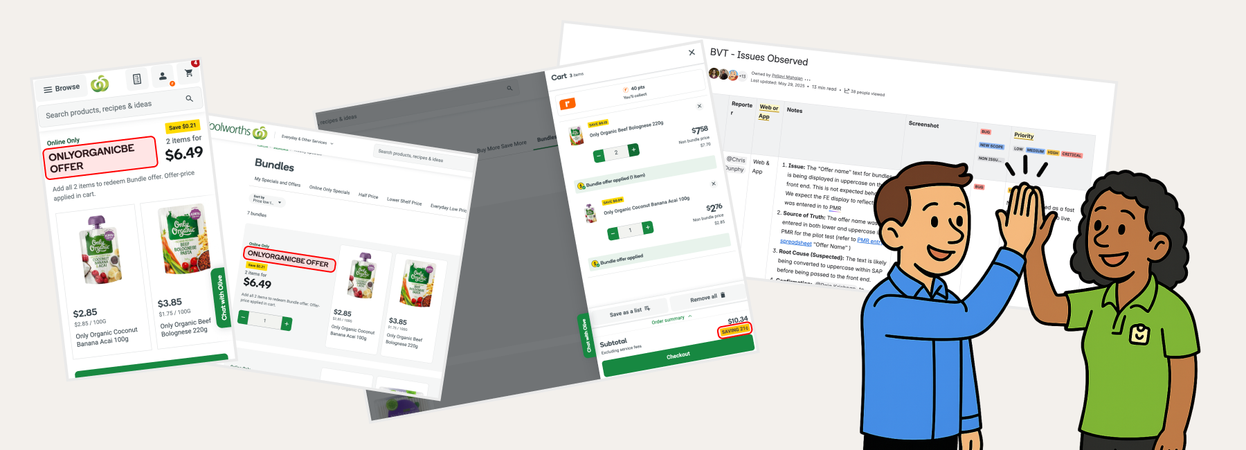
End-to-end Testing & Dev QA
Many months after the first kickoff meeting, a cohort of 25 volunteers participated in end-to-end testing of Bundles across Web and App. A lot of small issues were identified and catalogued, with the relevant squad developers fixing them over the course of the 2 week testing period.
Conclusion
Seeing Drop 1 of 4 go through end-to-end testing and executed to such a high level was a big milestone achievement, and makes all those challenging conversations and debates worthwhile!
Our strategic prioritisation allowed my extended team to deliver a solution that:
Reflecting on the effort, coordination and teamwork it required to deliver Drop 1 both inspires me and makes me feel proud.
Inspired by the resilience and creativity of the extended team, and proud of the design team who advocated for the best user experience, often against the desires of some rather influential senior stakeholders and technical leads.
Thanks for reading!
What next?