Product Design Case study: Reimagining Australia’s Tourism Distribution Experience
A portal redesign with lessons in scope management, co-design, and navigating ambiguity.
The current state of play
In a world where we’re surrounded by choices of where to market our small businesses — the need for a ‘one stop shop’ is on the rise. For the likes of small ‘mom and pop shops’ or non-technical entrepreneurs starting their first business, there’s no better time to redesign Australia’s biggest tourism distribution network provider. Enter the Australian Tourism Data Warehouse (ATDW).
Meet the team
Myself and a small team launched our way into a 15-week-long fixed cost engagement. The team included:
- 1 x Senior Manager (Delivery lead)
- 1 x Manager (UX Design lead — myself)
- 5 x Junior Designers (Design & Research support)
- 2 x Technical Business Analysts
Over the course of the project, we would engage with over 150 end users, and up to 10 client-side technical and non-technical stakeholders to co-design the Minimum Viable Product (MVP) for the ATDW portal.
Horizon 1 of 3 — our chance to prove ourselves
This project was Horizon 1 of a potential 3 horizon project — and this meant two things:
- Whatever we designed, would be the MVP version of that part of the experience (no frills, no fuss)
- Whatever we delivered, would determine IF we did or didn’t get hired for the next 2 potential phases of work
Additionally, being a Fixed Cost engagement meant that whatever we designed, would need to be achievable for the dev team to build in the hours budgeted for. Anything outside of that would result in a Change Request, or would simply be de-scoped.
So with this framing our engagement, we started working with what was honestly one of the nicest clients and cross-functional teams I have worked with to date 🙂
Stats at a glance
For those who love numbers, here are a few stats about the project…
50,000+ online profiles distributed through the API feed
40,000+ small-to-medium sized tourism businesses using the portal ever month
100+ data points about tourism profiles included in the API feed
12+ years since the last ‘redesign’
→ Just 10 ATDW Team members managing the business
… combine these stats with the fact that Australia earned $35.14 billion Aussie dollars from tourism in 2022, and you can start to see the need for a redesign to cash in on all those lost conversions from a poor UX…
The opportunity
ATDW has a great business. Since 2001 they have been helping business owners to promote a variety of offerings like hikes, scuba diving trips and accommodation — to food & drink, and a plethora of events.
But while they have had many successes, the team and their customers are constrained by the current platform in a few ways and they formed a set of requirements in anticipation of a large-scale digital transformation project.
Project requirements
In the week before our official kickoff (week 0) the project team received those requirements. They were categorised using the “MoSCoW” system (must-have, should-have, could-have, and won’t-have) and were helpful for determining our scope for the MVP.
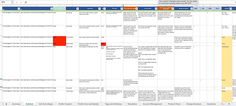
Requirements categorised by the MoSCoW system
Current portal pain points
Supporting the requirements, we also received prior research (survey results) which fuelled interviews with the ATDW team to unvcover any other known pain points within the portal.
Summary of the key pain points for different user groups:
- For all users:
Inefficient manual processes to extract complex reports, handle payments, and create new subscribers (yeah, new users couldn’t subscribe on their own) - For all users:
Jumbled up IA that doesn’t follow common patterns, and has had functionality added in places where it doesn’t logically fit - For all users:
Outdated UI — misplaced functionalities are hidden behind unconventional UI patterns, making them hard to find or understand, leading to a jarring and disjointed user experience - For all users:
Information overload — caused by a cluttered UI, and a heavy-handed approach to branding with a lot of orange and visually inaccessible color contrasts - For some users:
Unclear pricing structures that vary per state and don’t communicate the value proposition clearly
This was a good time to get to learn more about the portal users to understand specific use cases and figure out how to go about the redesign to ensure that all users’ needs were catered for.
User profiling
Across more than 40,000 end users, we were made aware of 6 clear groupings, each with distinct roles and user goals.
Demographic overview
Age: 20’s to 60+
Location: Australia, all states, metropolitan to rural locations
Digital literacy: Varied, some very basic
Users of social media: Varied, not all users
Internet connectivity: Varied, very poor in some remote areas
But we really wanted to learn about the roles and responsibilities of each group — and what types of features would be the most important to them…
6 key user groups
From ‘Super Admins’ all the way down to small businesses who may never own more than two profiles, we worked with the ATDW SME’s in Customer Experience and Marketing to understand motivations and platform needs.
Here’s a summary of the user groups we learned about:
- ATDW Admin aka ‘Super Admins’
Who: Members of the core ATDW team. In essence, super admins of the portal who can see every page and function.
Main goals: Performing QA on profiles, extracting reports, and performing bulk actions - State Tourism Operators — STOs
Who: State tourism bodies (eg: Queensland.com)
Main goals: Performing QA on profiles, extracting reports, and performing bulk actions for profiles in their state only - Regional Tourism Operators — RTOs
Who: Regional tourism bodies (eg: barossa.com — this is a wine region in Australia)
Main goals: Performing QA on profiles, extracting reports, and performing bulk actions for profiles in their region only - Distributors
Who: Businesses that display the ATDW feed on their websites to promote tourism (eg: booking.com)
Main goals: Subscribe, then create their own custom data feed, to integrate and display a selection of hand-picked profiles on their site (eg: all the best Wine Tours in Victoria) - Industry (brands)
Who: Owners of an accreditation (eg: Wheelchair friendly venues) used by Operators to tag their new Accommodation profiles
Main goals: Review any new listings that are published and tagged using their accreditation — to ensure quality and integrity - Operators
Who: Small businesses aka ‘mom and pop shops’ who want to promote their offering in the ATDW feed and across Australia
Main goals: Easily create high-quality profiles, and monitor the value of their ATDW profiles
Understanding the ecosystem
I then took a moment to test my understanding by sketching out what I understood of the whole ecosystem and the processes within it. This helped when it came to defining the IA — it also helped to speed up the onboarding of any new team members, by having a visual map to refer to.
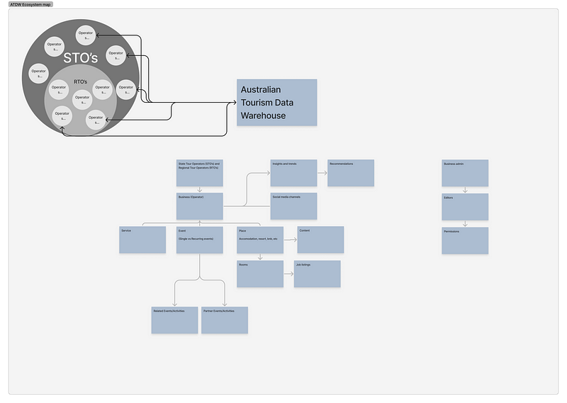
The ATDW Ecosystem including high-level processes
Having intimate knowledge of these groupings would help me to document permission rules (who would see what pages in the IA) and to specify how filters and list views (eg: on the homepage) would be personalised to optimise the experience for each group.
We also used these groups to co-design a set of Design Principles so that we were all aligned on the desired end user experience for the different groups.
8 design principles
We all agreed that the new ATDW portal should…
- Be as self-service as possible
- Maintain AA Accessibility standards to cater for varied abilities
- Have best-in-class usability as a result of user testing with key user groups
- Contain proactive messaging — keeping users informed of progress along key stages to reduce avoidable contacts
- Be appropriately suggestive of optimisations, to set Operators up for success
- Become the go-to management portal for Operators’ businesses instead of being one of many platforms they need to maintain
- Reduce work for Operators, through smart defaults, pre-filled information, and easy syncing across their digital footprint
- Creates space for ATDW and STO staff to support operators in different ways by automating recurring reminders and increasing self-service
These principles set us off in the right direction, and we quickly got to work on the foundations of the new portal — the Information Architecture (IA) redesign.
IA redesign
An intuitive navigation helps with adoption and retention of a new or redesigned product. We knew that the existing IA was complex and in need of an update, so we started by understanding the requirements:
- The current state has some 150 pages and functions to account for
- It caters to 6 different user groups (mentioned above)
- The future state requires 3 access levels (Manager, Editor, Viewer)
- The future state will require some additional functions, so these need to be catered for (Eg: Bookings, Chat)
Thanks to the ATDW team who walked us through what each page and function does in the current portal!
Approach to designing the IA
With an IA, it’s essential to design the Conceptual Model (how your product works) to match the Mental Model of users (how they expect it to work). A good place to start is by researching competitor sites, to see how the majority of similar products structure their navigation.
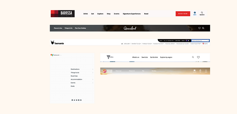
Tourism websites often have overlapping content categories, not well suited to portal use-cases
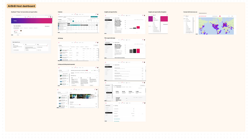
Example of a close competitor — AirBnB’s host portal with functional labels
Key takeaway: I learnt that most tourist-facing websites use emotive and aspirational language which overlaps between categories, while portals tend to stick with functional and unambiguous wording.
Structuring the new IA with Goal and Task model
I now had enough information to shape the requirements into the beginnings of an IA.
I filtered the original requirements list by ‘Must-Have’ features. Bulk importing them into FigJam, I could move them around and group them journey stage (Ie: Account creation, Create profile, etc).
This helped me to make sense of it all, and form a loose IA around — labelling what would be a page, where sub pages would sit, and any additional functions to include on the pages.
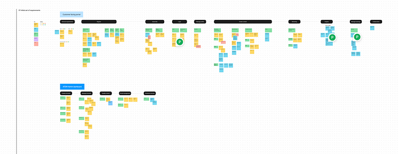
Taking the requirements and grouping them logically to create the beginnings of the IA
Using a Goal and Task model to finalise the first draft
I finalised the first draft of the IA using the Goal and Task model approach, considering all that we had learned so far:
- User types
- Pain points
- Horizon 1 (and future requirements)
- Common patterns and approaches across competitor sites (from the desktop research)

Goal and task model used to create a structure for the IA, and uncover any gaps in functionality
Transferring this version into Excel made it more presentable — and got it ready for the TreeJack testing. Truth be told we debated the structure and created 3 versions in Excel but managed to reach an agreement on which version to test in TreeJack.
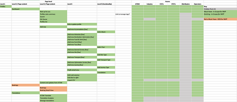
The first draft IA (version 3), ready to be uploaded into TreeJack
Exploring nav execution options
Designing an IA in TreeJack or in Excel is one thing — but visualising it in the right way for a great user experience is just as important. Here I created some ‘quick and dirty’ sketches in FigJam to see what would work. Remember — the existing nav was a vertical left-hand nav, and we were proposing to change it to a top nav bar. This was a drastic shift, so we really needed to be confident about how it would work across the site.
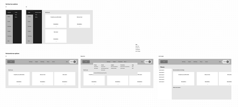
Mockups in FigJam helped me to visualise how different levels in the IA would be accessed by users
Digital transformation challenges
As mentioned before, signing off a new IA was no easy task and while reviewing it was clear that there were some additional barriers to overcome. A team who have used this portal for 10 years, can be tricky to convince that this new approach will be better.
What helped move this along was to back up our recommendations with references to best practices, and often times had to eat humble pie and change our approach as we learned more about the ATDW team’s workflow.
Key takeaway: While we are the UX experts — the client is the super-user and the SME. Throughout the project I made a point of understanding the full picture, by asking why, why, and why again.

Our IA in TreeJack, ready for Round 1 testing
TreeJack testing to validate the new IA
Our approach to the redesign was to be data-driven — and we made a point of measuring before and after scores on the IA and all interface designs.
This is always a great way to measure your impact, and prove the value you are providing — whether it’s an IA redesign or a full UX overhaul, nothing says Success like a set of numbers do.
Testing the most important tasks
As always, we prepared the testing tasks in collaboration with the ATDW SMEs to ensure we were testing for the primary use cases for each user group.
Preparing 6 separate sets of tasks and TreeJack tests (one for each group) is no small job! Luckily we had the junior designers to support us.

TreeJack tests for 6 different user groups, means creating 6 unique tests and sets of test tasks…
Our questions were all task-based (eg: where would you go to create a new profile?) but we also asked a few post-test questions, for example…
“Do you think the newly designed IA is better than the current portal IA?”
In a transformation, where you will literally impact tens of thousands of users — this is important to gain confidence on and to be able to report back with complete certainty.
Results of testing
After running two rounds of TreeJack testing, we were happy with the results we had achieved and were confident to proceed into the Detailed Design phase. Here’s a summary:
- Time On Task reduction of 56% between Round 1 and Round 2 (from 11.35 mins down to 4.96 mins to complete the test)
- Success and Directness rate improvement of 3% (from 52% to 55.8% in Success rate, and from 63% to 66.2% in Directness rate)
- 25% increase in perception of usability (old vs new IA)
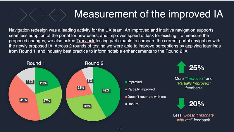
Comparison between Round 1 and Round 2 usability perceptions — a big improvement!
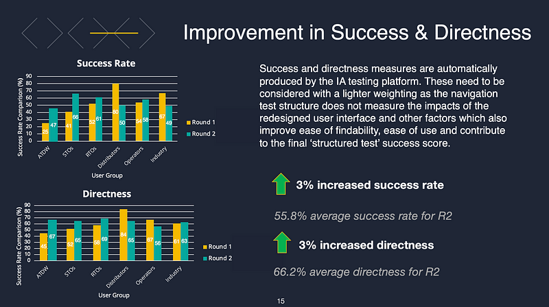
Comparison between Round 1 and Round 2 Success and Directness — small improvement
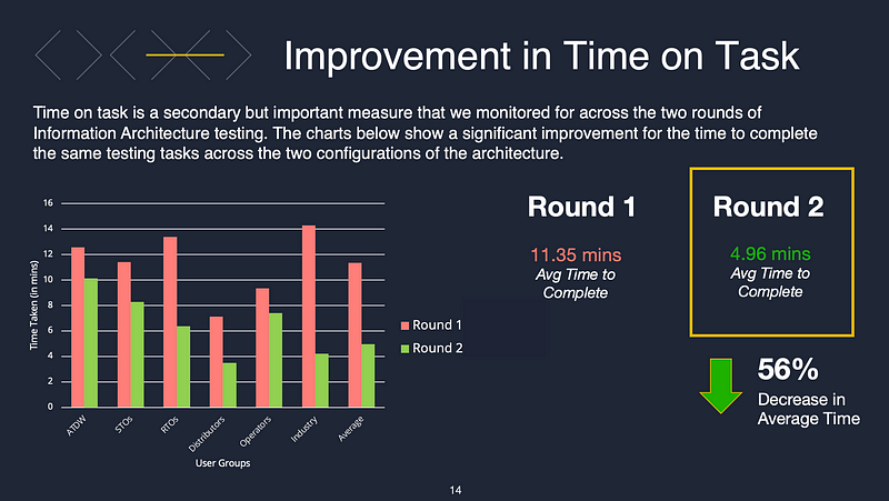
Comparison between Round 1 and Round 2 Time On Task — a big improvement!
A note about the results: A treeJack Success and Directness score of mid 60’s can easily shoot up to a 90 in actual usability testing on a prototype . Because the TreeJack test is so basic, when the IA is built out into a detailed UI, it can really make a big difference to the score and end user experience.
This proved true in our case when the IA (achieving a modest mid-60 % Success Rate score in TreeJack ) shot up to a much higher usability score during prototype testing.
Key changes that improved metrics
Here are some quick wins you can use on most projects to ensure your 1st draft IA will be well received. Each project is unique, but these are the tried and true best practices for an IA 🙂
- On portal IA’s, use functional labels rather than emotive, ambiguous labels (which are often used in simpler, tourist-facing or brochure-style websites)
- Use fewer Level 1 categories, by merging similar ones (we started with 9, but ended up with 6 level 1 items)
- Word your Level 1 items carefully, so they are mutually exclusive — rather than being ambiguous labels which may appear too similar and cause confusion and unnecessary cognitive load
- Use cross-links to meet user expectations (add links to pages, where users expected to find them in the IA. Eg: add a link to ‘Create new Deal or Offer’ from the Homepage, if that’s where users looked in the TreeJack test)
These may seem like subtle improvements, but in the end, they had a big effect on efficiency and the user experience.
Design phase
Now that we had proven the IA was robust, well understood, and unanimously voted as being better than the current state experience, we had the confidence to move forward into detailed design relatively risk-free.
Overall approach
Unlike a Discovery or Future Visioning piece, this project was fully focused on delivering a built out experience (Design and Deliver). The work involved two parts:
- Portal migration to Cloud Infrastructure
- UX uplift of key user journeys (our job)
This meant we had to be strategic about what we designed, versus what was simply left to the developers and the BAs to migrate across in its existing state.
Agreeing on key user journeys
Based on the requirements and our knowledge of the most important user goals, and revenue drivers for ATDW, we proposed 8 key user journeys to focus on:
- General site structure and navigation
- Account creation
- Business profile creation & business switch
- Create & edit profile
- Profile list with filters
- Admin user content QA review
- Distributor subscription flow
- Analytics navigation
Anything outside of these journey wouldn’t get a design treatment, it would simply be recreated on the new portal in it’s current state.
Setting up the design file
I knew we would be creating a beast of a file. A space to design, get feedback, and run user testing sessions. Also, a place to document some technical details for a smooth developer handover.
Here’s how I set it up:
- Started using a UI kit
A generic design accelerator with colours and typography styles set up, and a few generic components — although these didn’t add much value because there was a lot of pivoting - Separate prototype pages
Keeping them on their own pages meant we could design while user testing was being run - Separate detailed design pages for user journeys
Detailed and ‘final’ designs were kept on their own pages (this is where we iterated and applied any feedback) - Notes and components
We documented components accompanied with notes for the BAs to aid the handover process for the devs and BAs
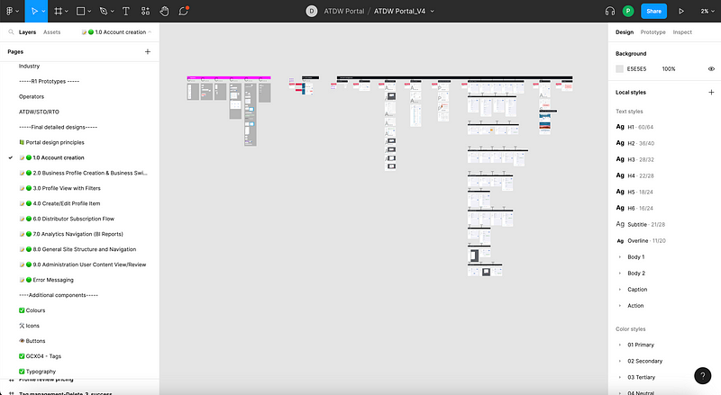
I set up a page for each user journey, which contained screen designs and all components used
De-risking design with co-design workshops
An essential part of this project was a collaboration with the SMEs to ensure that we were designing fit-for-purpose experiences.
Many of the new features didn’t have detailed requirements, nor did they exist in the portal. The way we de-risked our progress on the more complex features was to run weekly UX Progress Validation sessions. This was a chance to play back our latest work, test our understanding, or collaborate on a new feature.
We ran 12 sessions, each one 90 minutes long. We always came away with a lot of notes and confidence to proceed without any doubt or blockers.
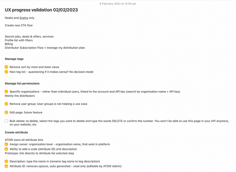
We always walked away from sessions with useful of feedback and confidence to continue
Scope management
While I have mentioned how lovely the client was, and how happy our team was, there was a very real element of scope management that if left unattended would lead to problems in delivery further down the line.
For example, the ‘Account creation’ user journey quickly went from being a simple user journey, to a collection of 30+ screens and various associated sub pages.
To keep ourselves focussed on the core user journey we intentionally left some screens blank (with a note to the dev’s to use existing functionality) so that our efforts could be focussed on what we were contracted to deliver.
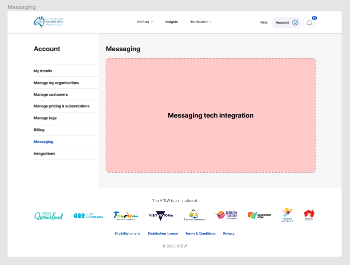
Placeholder left for the Messaging component
What happens if you don’t manage scope?
In the context of this project, not managing scope and designing too much for your development team risks resulting in one of two things:
- Not enough resources
The team can’t deliver all that was designed due to lack of time or team members = unhappy clients, unhappy team - Poor quality delivery
The team tries to deliver it all but does a poor job because they don’t have enough time and are forced to rush and cut corners = poor quality build, unhappy dev team, unhappy client
Top tips for managing scope:
We really had to keep an eye on scope, as we knew the development team only had 12 weeks of development effort to deliver the MVP.
Here are some principles we followed:
- Make a clear distinction between what is an H1 requirement, versus an H2 or H3 enhancement. Anything that is not an H1 ‘Must Have’ should be captured in the backlog
- Constantly frame the conversation around what’s an H1 Must Have and what’s not — and be prepared to trade features in and out of scope where it makes sense
- Design key user journeys only (if your project permits it)
- Design using re-usable components, and document them clearly so the dev team can work as efficiently as possible, without accidentally building the same components more than once
- Be as lean as possible (for example: in some cases, we only documented high-level journey flows, instead of designing every page — let the Front end developers and the BAs manage the creation of those flows)
Possible backlog requests in Confluence — where we kept anything that wasn’t an H1 ‘Must Have’
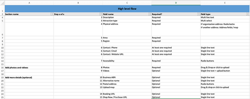
How we ‘designed’ the 11 unique Create Profile journeys — we didn’t, we just left notes for the devs and BAs to piece them together using existing components documented in Figma
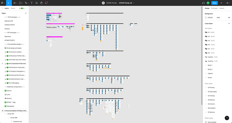
Our file — with components on the left (in the pink section) and screen designs with yellow notes for the BAs, on the right in the black section
User testing
Because the 6 user groups form different proportions of the total user base (ie: there are far more Operators than there are ATDW team members), it was important that we sourced the right representative sample sizes for each of the groups.
We ran 55-minute-long sessions over Teams with one interview lead, and a note taker capturing verbatim notes in FigJam.
As usual, there were technical challenges, for example, in one case we even had to click through the prototype on behalf of the participant and ask them ‘what they would do next’.
Synthesis and additional learnings
After each interview, the verbatim notes were colour coded according to the type of information they contained…
- Pain points
These informed required changes to the prototype, and even highlighted some offline process inefficiencies (eg: gaps in the QA process) - Insights
These were more subtle behavioral details (eg: how often users visit the portal, and why) - Likes
What users loved about the new or old design (useful for reporting back to stakeholders after user testing) - Wants
Potential future enhancement opportunities, both in the portal experience and offline processes - Observations
Subtle observations about how users interact with the interface (eg: users look for the Search bar first, hence, we should make it more prominent)
These all fed into our final user testing report and informed the design changes we made between testing rounds and to finalise the experience.

Note taking template we used, created in FigJam
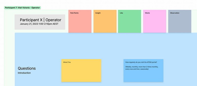
Colour coding our insights helped with the quick synthesis and formation of recommendations
Round 1 insights
Here are some of the highlights from round 1:
- 8 out of 9 users responded positively to the idea of a Grammarly integration for writing better content
- 8 out of 9 wanted the ability to bulk upload photos
- 5 out of 9 users were confused by the image editing UI, and wanted more flexibility in the functions available to them
- 4 out of 9 users wanted the ability to add a separate description per season, to highlight attractions at different times of the year
- 4 out of 9 found the Save and exit buttons confusing and weren’t sure if it would also submit the profile for review
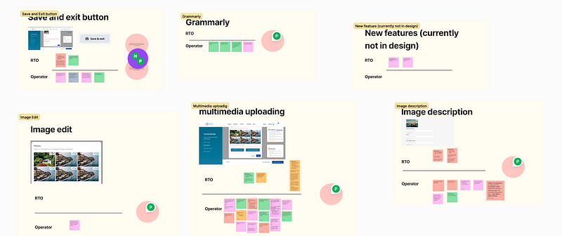
We synthesised our notes in relation to specific UI elements where practical
Round 2 insights
In round 2 there was less feedback, but we still learnt a bit about what users thought of the new design:
- 10 out of 20 users requested more specific error messaging for the bulk photo’s upload feature (Why was the photo rejected?)
- 6 out of 20 users expected the homepage to be personalised to them (I want to see my name there)
- 8 out of 20 users said the profile listings on the homepage needed to be bright higher up the page, rather than other content
- 8 out of 20 users found the Create Profile flow slightly confusing (I don’t understand these groupings, it’s not what I expect
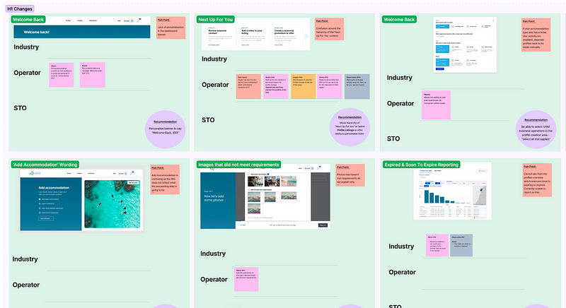
We synthesised our notes in relation to specific UI elements where practical
Usability score
Fast forwarding through the 2 rounds of user testing, with all the updates applied, sitting through the occasional no-show, and learning a lot about our users, we arrived at a milestone.
Understanding if what we had designed, was better than what was there.
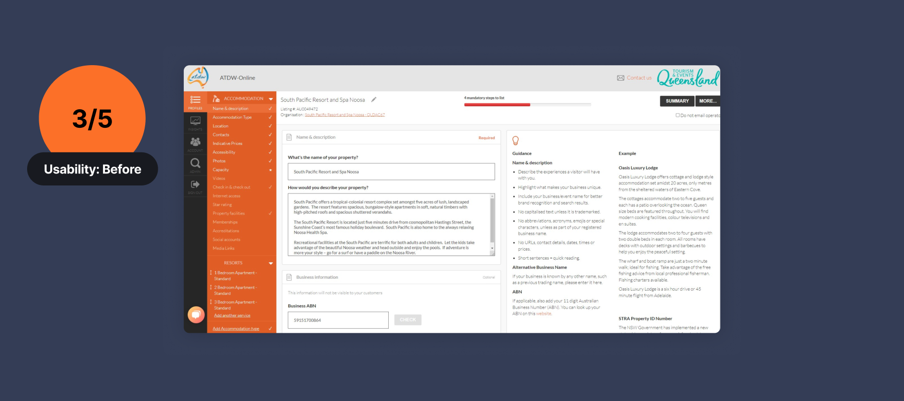
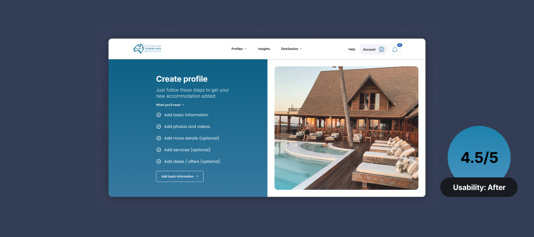
Comparing the usability score for the current portal with the Round 2 prototype revealed an improvement, jumping from 3/5 to 4.5/5!
This was a fantastic outcome, and it felt great to share this with our ATDW team.
Form design learnings: One of the key insights we gained from user testing interviews, was that Operators want to create profiles quickly without stepping through every single field. We moved all of the mandatory fields to the start of the form so they can get in and get out by completing only the bare essentials.
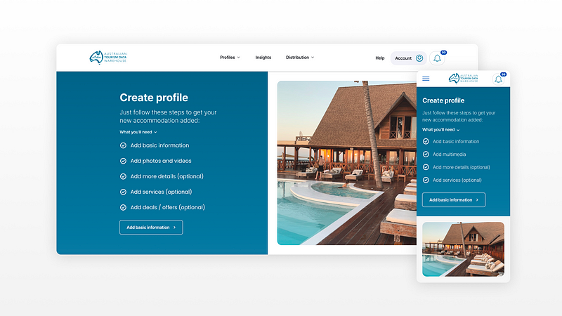
Font-loading all of the mandatory steps meant Operators could get in and get out without stepping through every single field — they really liked this
User testing report
Once we had completed all of the user testing sessions, we compiled a report describing our process, how many users from each group had been involved, and some of the key likes, pain points, wants, and needs.
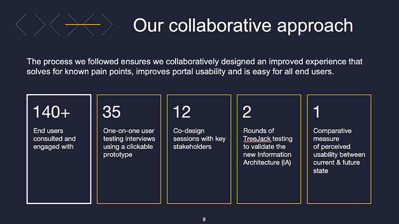
A breakdown of our process
What users liked
The overall feedback on the new experience was positive, with some highlights including:
- Clean and easy to use UI
- A massive improvement on the current portal
- There’s a good level of detail — there’s a lot of detail, but it’s still easy to use
- The new permission structure (where users can have multiple businesses under a single personal account)
- Excitement about the new Insights section (which features 27 PowerBI data dashboards to help with reporting)
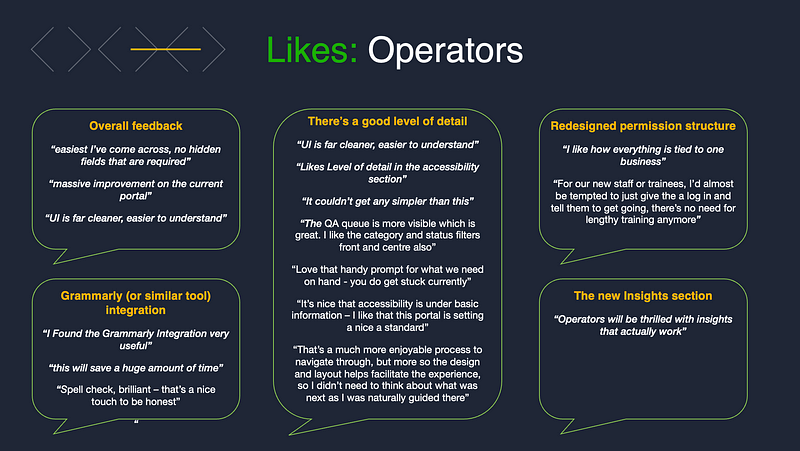
What Operators liked about the new design
User pain points related to the offline process
Some of the reported pain points related specifically to the design, and we were able to address them. But others related to offline processes that were out of our control, so we packaged these up and handed them over to the client as potential future enhancement opportunities.
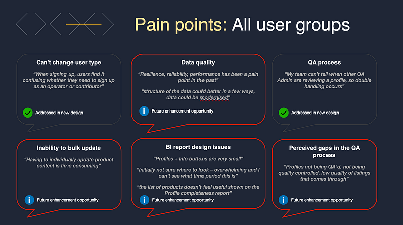
Pain points for all user groups
Transitioning from Design to Delivery
If you’ve ever designed something that got built, you’ll know there’s a lot more to building a website than creating a few screen mockups — and this is our team had two BAs…
Their role was to document details such as permission structures, and functional requirements, and create functional annotations for each screen design — so that the development team would know exactly how each component (eg: Button) would connect to what eg: Data point/system/page.
Getting into the details
A big consideration was the fact that were were migrating a platform, and redesigning what data was being captured in the new API (data feed), while the old API was still sending tourism profiles to existing Distributor websites.
With all the design changes, new information being captured, and old attributes being discarded, we had to track how the new data set would be different from the old one — and how old integrations would remain compatible with the new feed.
Basic example: if we are no longer capturing two addresses per business, which one from the old feed will become the primary one?
Pretty complicated — but that’s why we had the BA’s: to connect the creative user experience design we had reimagined, to the very real and technical constraints of the final developed product.
Dynamic updates and communication
The iterative nature of design meant there was a lot of back and forth between designers and BA’s. And with the BA’s documenting functional specifications while designs were in flight — communication of any changes was essential, as was dynamic updating of designs in Confluence.
By embedding our Figma designs directly into the functional specs in Confluence, they updated dynamically and it saved everyone a lot of time.
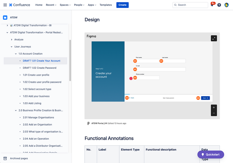
Our junior designers annotated each of the wireframes with tidy little symbols, which then displayed in Confluence.
Leaving notes in Figma also helped the BAs to work without any blockers, or uncertainty as to how a page might function.
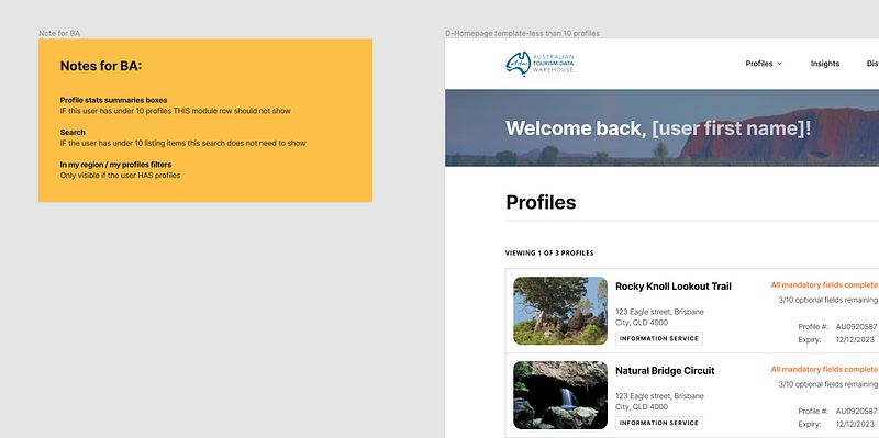
Leaving notes for the BA’s makes their life a lot easier
Sharing progress and taking the client on the journey
From the start we had been advised of the importance of bringing all affected stakeholders and portal users along on the journey. This would help with adoption and ensure that all feedback had been considered along the way — again, important given there was the potential of two more horizons of work to win.
With this in mind, we provided monthly showcases to demonstrate our progress and answer any questions or address any concerns.
Showcase and questions
For each showcase, groups of up to 80 people turned up — comprised of ATDW team members, STOs, RTOs, Distributors, and Operators.
The main focus was on design updates followed by a lively Q&A session. Design tended to take the centre stage, as technology updates are often harder to communicate to a non-technical audience. Most of the audience just wanted to hear about the user experience uplifts and how it would make their lives easier.
Uplift at a glance
The most valuable updates we provided were the ‘Uplift at a glance’ slides. Showing what the existing experience was vs what it had changed to, helped to communicate the value we had provided.
The final showcase ended with just one question from the audience, which we took as a positive outcome!
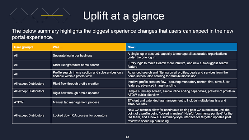
Example slide from the ‘Uplift at a glance’ section demonstrating the impact we had delivered for each user group
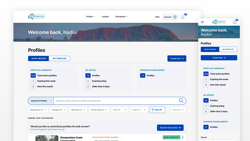
A mid-fidelity wireframe, ready to be handed over to the visual design team for application of the soon-to-be-released brand guidelines
Ending on a high
With the showcase done and positively received, high usability scores in the bag, and some kind words from our client — the project ended on a high with the designs and functional specifications off to the front-end and back-end development teams for build.
A few handover meetings combined with well structured files, clearly documented components, and additional notes where required, will help the dev team of 4 to build the MVP within their allotted 120 working days.
From the design team’s perspective, we know the final build may look slightly different from what was designed — as the tech team may need to make decisions to improve efficiencies, or to align more closely with the development accelerator they are using — but that’s ok. I once heard a great saying about Product Design:
An idea in the design process is like dropping a pebble in a stream. The thing you put in at the start will change by the time it reaches the end.
I believe there’s beauty in letting go of control and allowing the team takes the initially desirable concept forward into a solution that works in the real world, within the constraints of feasibility and viability.
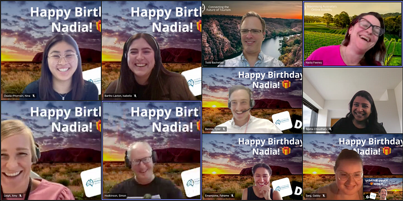
A surprise birthday background for our main stakeholder got smiles all round
A poem by me and ChatGPT
At the final standup, I dropped a surprise poem (with help from ChatGPT) as a final thank you for such an amazing project. The CEO, digital director and our key stakeholders loved it — all I hope is that it helps us to win the next phase of work 🙂
ATDW’s Digital Dream
In the world of business, two names reign supreme
Deloitte and ATDW, a powerful team
Together they strive for digital perfection
Transforming the industry with their innovation.
Todd, Nadia, Sneha, and Mahesh lead the charge
With passion and skill that’s truly large
Their expertise in tech is a sight to behold
As they make digital transformation effortlessly unfold.
And in the midst of this dream team’s quest
Ed Sheeran joins, a surprise addition — who would’ve guessed?
His music inspires, his grooves resonate
They’re a force to reckon with, no one can debate.
With user testing at the forefront of their game
The team ensures their success is not in vain
Their vision for the future is bright and clear
A world of tourism operators, celebrating with a cheer.
So here’s to Deloitte, ATDW, and the team
Their work towards digital transformation, a beautiful dream
May they continue to inspire and innovate
As they shape the world into a digital landscape.
Client feedback
“Justin that was excellent — thank you. That was a really informative session, and I so appreciated the level of feedback you shared from the UATs. Seldom do I ask no questions 😉”
— Jan Hutton, CEO ATDW
“…Appreciate you bringing your bright personality and expertise to every meeting, and it shines through in all you have delivered. It has been such a pleasure working with you”
— Nadia Feeney, Senior Manager, ATDW
“Once again, you have been a true value add to our team and we’re envious of those who receive you on their future engagement”
— Todd Bachelder, Technology Director
Thank you very much Justin. You’re an absolute legend… Love your dedication and fantastic work 🙂
– Maheshkumar Jaghamani, Technology platform manager
